Score: 6/10 (Okay) Pros Extremely light, relatively fast for a mid-range handset, rear-facing camera takes pretty good pictures. | Cons Boring and ugly design, display is fuzzy and soft, outdated version of Android 4.2, TouchWiz feels slow and bogged down, other (and better) options available for same or slightly higher price. | Not every smartphone is made to be a top-tier device. There are handsets out there like the LG G2, Samsung Galaxy Note 3, and HTC One that strive to be the best, but there are also devices like the Samsung Galaxy S4 Mini that try to be good smartphones. Not great, not revolutionary, but good. Why do we need smartphones like this? Because they generally offer a much lower price tag than other competing smartphones, while still offering a relatively good experience. While the Galaxy S4 Mini isn't the worst phone I've ever reviewed, and although it isn't the most expensive, Verizon (carrier we got the S4 Mini from) is currently selling handsets like the LG G2, Moto G, Moto X, and more for the same or lower price. Should you shell out your money for the S4 Mini if you're looking for a simple, mid-range handset? Let's find out in my full review! Design/Build Quality Being a mid-range smartphone, I wasn't expecting the S4 Mini to have that great of a design. That's because it doesn't. Unlike the Galaxy Note 3 and new line of TabPRO and NotePRO tablets which all feature Samsung's fresh and comfortable faux leather backing, the S4 Mini retains the infamous hyperglaze plastic which Samsung has been using for far too long. In regards to other looks of the S4 Mini, just imagine the original Galaxy S4, but with a shrunken down body and a 4.3-inch display. You still have your same physical home button with two capacitive navigational buttons, faux chrome wrapped around the frame of the body, 3.5mm headset jack and IR blaster on top, volume rocker on the left, power/lock button on the right, microUSB charging port on the bottom, and camera and speaker on the back. One aspect of the S4 Mini's construction that really surprised me was just how light it was. Samsung phones are never known to be heavy devices, but weighing in at just 3.77 ounces, the S4 Mini has just about nothing to it. I often forgot that the phone was in my pocket when going about my day. Unfortunately, the Galaxy S4 Mini suffers from the same fate that many of Verizon's other products suffer from: Logos. My God, does the Galaxy S4 Mini have a lot of branding on it. On the front, you'll see a Samsung logo placed just above the screen, while Verizon has decided to slap their own branding right on the physical home button. Going onto the back, you'll see two more Verizon logos placed just below the LED flash, and additional Samsung branding added above the speaker. I understand that OEMs and carriers need to place their name on these products, but I can't help but feel that five logos is just a bit overkill. Hardware With phones being released with 6-inch+ screen sizes nowadays, it's sometimes easy to forget where phone screen sizes were like just a couple of years ago. With its display measuring in at 4.3-inchs diagonally, the Galaxy S4 Mini is absolutely tiny when compared to what else is currently on the market. Personally, I am not a big fan of the smaller screen real-estate found on the S4 Mini. While it is nice to be able to easily access all four corners of the display without having to stretch my hand much at all, I found that I had a not-so-pleasant time typing text messages, watching video, or playing games. Part of this is also due to the S4 Mini's screen resolution. With a 960 x 540 qHD display and just 256ppi, the S4 Mini's screen just doesn't look that great. While the Super AMOLED technology helps with being able to produce high color saturation and deep blacks, I still found that text was soft and fuzzy, app icons were pixelated, and videos looked underwhelming. I do realize that since this is a budget handset it isn't going to have the best specs, but there are other phones out there for about the same money that offer much better displays all around. As for processing speeds, the Galaxy S4 Mini is powered by a 1.7GHz dual-core Snapdragon 400 CPU and 1.5GB of RAM. In normal day-to-day use, the S4 Mini performs fairly well. Although lag is noticeable when swiping through home screens and opening applications is usually met with some form of delay, normal usage usually runs pretty good. Even games like Beach Buggy Blitz ran surprisingly smooth on the handset. In regards to its optics, Samsung has thrown an 8MP rear-facing camera with LED flash and a 1.9MP front-facing camera on the Galaxy S4 Mini. Despite being a mid-range handset, pictures taken with the S4 Mini turned out pretty good. Colors were accurate, details were fairly sharp, and the S4 Mini still has a good handful of picture-taking software. You won't get the image quality or features found in the original S4, but Samsung definitely could have done worse with the cameras on this phone. The Galaxy S4 Mini that I reviewed is the Verizon Wireless variant. Call quality on the phone was okay. Folks I talked to were loud, but I've definitely heard better audio quality on other competing handsets. Data speeds were just as consistent as we usually see on Verizon as well.
To last you through using the phone, the Galaxy S4 Mini is packing in a 1,900 mAh removable battery. For the type of phone this is, battery life was pretty good. With moderate to heavy usage throughout the day, I never had any issues getting through an entire full day with the phone.
Software The Samsung Galaxy S 4 Mini is running Android version 4.2.2 Jelly Bean out of the box with Samsung's TouchWiz layered over it. With 4.4.2 KitKat now the latest and greatest version of Android currently available, 4.2.2 Jelly Bean is feeling mighty old at this point in time. There is an update to Android 4.3 that is just starting to hit handsets via OTA updates, but my review unit never did receive said update. Android versions aside, Samsung's TouchWiz does just as fine a job as ever make Android feel childish and like a toy. If you recall our review of the original Galaxy S4, you'd remember that I really liked TouchWiz on that handset. The features of MultiWindow, Air Command, Smart Scroll and more really did enhance the overall experience for me. However, on the Galaxy S4 Mini, none of those goodies are found anywhere on the device. Final Verdict
Even though it's being marketed towards first time smartphone owners and anyone really looking for a relatively cheap smartphone option, it feels like Samsung made a few too many cuts with the Galaxy S4 Mini. It may be light, run fairly smooth, and take decent photos, but those are just about all of the redeeming factors I can conjure up when I think about the S4 Mini. The S4 Mini has an ugly design, bad display, an outdated version of Android, and a price tag that is far too high for what it brings to the table. Verizon Wireless is currently selling the Samsung Galaxy S4 Mini for $49.99 with a new two year contract. While that may not sound like a lot, consider this: You can currently pick up the Moto X, LG G2, and DROID MINI, for the exact same price with a new two year contact with Verizon. The Samsung Galaxy S4 Mini isn't the worst phone out there, but it just can't meet or beat the competition it has going against it. If you're new to the smartphone world, and just want something that's small, easy to use, and covers all of your basic smartphone wants and needs, the S4 Mini should serve you just fine. Just keep in mind that there are better choices out there for the same cost, and even more awesome gadgets out there for just a little bit more money.
Score: 7/10 (Good) Pros Comfortable in the hand, loud speakers, 720p HD screen looks really good, fast and fluid, good call quality, excellent battery life, BB10.2 is a good improvement over BB10. | Cons Boring design, lackluster gaming performance, mediocre camera, only available on Verizon, BlackBerry World is in desperate need for good content. | BlackBerry isn't in that great of a situation right now. Their numbers continue to drop, they have virtually no market share when it comes to consumer products, and they haven't had the groundbreaking flagship smartphone that they desperately need right now. Their latest smartphone, the BlackBerry Z30, is the newest flagship device the company has kicked out. While it's not a bad phone by any means, it's not the type of phone BlackBerry needs. It's a good phone, but good isn't what the company needs to stay afloat in the consumer market. Let's dive deeper into the Z30, and see why this handset could be one of the last consumer smartphones we see from BlackBerry. Design/Build Quality From a design standpoint, the BlackBerry Z30 isn't all that attractive. The Z30 is mostly just a black slab with slight grey accents that don't do too much for the overall look of the phone. On the front of the device is its large 5-inch display with a solid silver bar resting below it. Going to the top of the screen you can find the phone's earpiece speaker and 2MP front-facing camera. On the right-hand side of the device you will find the volume rocker with the physical button to launch the voice assistant in the middle of that. Below the rocker you will find two noise-canceling microphone pinholes. On the left side of the handset you will see the phone's microUSB and microHDMI ports. Located on the top edge is the 3.5mm headset jack and power/lock button. On the bottom edge is just a small fingernail cutout to remove the back plate of the phone. Moving on to the backside you will see the 8MP rear-facing camera with LED flash, along with the Z30's dual-speakers. Although the Z30 may not be a pretty phone, it has some of the loudest speakers I've heard in recent memory on a smartphone. Audio is astonishingly loud and delivers surprisingly good base levels to produce a truly great experience when listening to music and podcasts. Another nice aspect of the Z30's construction is the material used on the backside. The back of the Z30 is made out of a soft-touch rubbery grip that feels oh-so-good in the hand. The Z30's design may not win any awards for looks, but it does do a pretty good job when it comes to functionality. Hardware The Z30 boasts a large 5-inch display, and that's the largest screen we've ever seen on a BlackBerry handset. That screen has a pixel resolution of 1280 x 720 and brings along 295ppi. Although the display quality doesn't come near the 1080p FHD displays out there with 400+ppi, the Z30's display still looks quite nice. The Z30 uses a Super AMOLED panel, and this brings high color contrast, deep blacks, great viewing angles, and solid outdoor visibility. Unfortunately, the Z30's screen doesn't get that bright. Even with the brightness turned all the way up, I still sometimes found myself wanting the screen just a bit brighter. To power you through everything you do on the Z30, BlackBerry packed in a 1.7GHz dual-core Qualcomm Snapdragon S4 Pro chipset and 2GB of RAM. Most operations on the Z30 run quite well. Navigating through your home screen, browsing the Web, streaming video, and using applications always felt fast and responsive. However, when playing Jetpack Joyride I did notice some occasional stutter. It wasn't anything game-breaking, but it was a bit disappointing to see a flagship smartphone struggle with a game as light as Jetpack Joyride. The BlackBerry Z30 features an 8MP camera on the back with LED flash, and a 2MP front-facing shooter. Although the cameras on the Z30 may not be the worst I've ever seen on the smartphone, they're certainly are a far cry from the best. Photos taken with the rear camera look okay, but details always appeared softer than I would have liked. Photos taken in low-light situations are also met with far too much digital noise. The front-facing camera isn't much better, but does get the job done for quick selfies and video chatting. The BlackBerry Z30 is an exclusive to Verizon Wireless in the United States. If BlackBerry wants to make any attempt to get their numbers up, having their flagship handset exclusive to one carrier isn't going to help them at all. With that said, the Z30 does offer really great call quality. With Verizon's network, I never had any issue with always getting a strong connection, and the 4G LTE data speeds are always fantastic. People I talked to sounded crisp and loud, and I was told that I sounded great on their end of the calls as well. Another great aspect of the Z30's hardware is its battery. Housed inside the BlackBerry Z30 is a non-removable 2,880 mAh battery. Although the fact that it is not removable may turn some of you away, it shouldn't, as the battery in the Z30 is a great performer. On my first day of full use with the Z30, which included heavy texting, moderate Web browsing, moderate application usage, light game playing, and light picture taking, I still had 45% remaining at 11:00 PM after having first turned the phone on at 7:00 AM. I never had any issue getting through an entire full day of use with the Z30, and could probably get through two full days if I used it correctly. Software The Z30 ships with BlackBerry's latest version of its mobile operating system, BlackBerry 10.2 BB10.2 still operates much like the original BB10 did, but brings a very cool new feature to it. That feature is Priority Hub. When swiping over to your BlackBerry Hub in 10.2, you will notice a new category named "Priority Hub". Priority Hub is essentially a curated Hub of all of your truly important contacts, messaging conversations, ongoing emails, etc. The BB10.2 OS will look for conversations and interactions you have the most of in Facebook, Twitter, emails, and messaging, and automatically add them to your Priority Hub. You can also manually add items to your Priority Hub. Simply go to the information you want to add, hold down on it, tap the up arrow, and that is now in your Priority Hub. It's not that big of a feature, but it does make finding the stuff you truly care about a heck of a lot easier. All of the features you came to love in BB10 are also still present in BB10.2. The Peek gesture still lets you view your BlackBerry Hub inbox no matter what application you are in, and the fantastic multi-tasking we saw introduced in BB10 is still here and still awesome. BB10.2 is heavily gesture driven, and while this may not be a good thing for everyone, I find it very useful and practical. All of the gestures in BB10.2 work surprisingly well, and are always fast and smooth. Another great area of the BB10.2 software is with its keyboard. Despite not having an iconic physical QWERTY keyboard that past BlackBerry handsets have been famous for having, the virtual QWERTY on the Z30 is outstanding. Typing on the Z30's on-screen keyboard is fast, accurate, and an overall enjoyable experience. As you use the Z30, the keyboard will learn phrases you commonly use, and will try to predict what you want to say next by adding completed words over the keyboard. To add those words to the message you are typing, simply swipe up on that word, and it is automatically added. While the core of BB10.2 is great, there is one area of it that is desperately lacking: Content. BB10.2 uses the BlackBerry World for its application and content store, but it is easily one of the least appealing I have used on a mobile device. Sure, you've got your big names on there like Facebook, Twitter, LinkedIn, and Evernote, but that's about it. You won't find Netflix, Instagram, Vine, Trello, YouTube, IMDb, Google+, or Spotify anywhere in the BlackBerry World. The list of lacking content goes on and on, but you at least now have an idea for just how sparse it is of even big name apps like I just listed. If you are coming to BB10.2 from Android, iOS, or even Windows Phone at this point in time, you will be greatly disappointed with the lack of available apps in the BlackBerry World. Final Verdict As you can see, the BlackBerry Z30 is a mixed bag of results. It has a good display, is relatively fast, has great call quality, an incredible battery, and great gesture-based software. Unfortunately, is also suffers from a boring design, lackluster gaming performance, mediocre cameras, and a desperately lacking app store. The Z30 is not a bad phone, but as I stated in the introduction to this review, it's not the flagship device that BlackBerry needs. The Z30 is currently selling for $199.99 on Verizon Wireless with a new two-year contract, and that just feels like way too much for what the Z30 brings to the table. When you can currently get the Moto X, LG G2, and HTC One on Verizon for cheaper than the Z30, it becomes apparent why this phone isn't selling like BlackBerry needs it to. If they could have gotten the price down to $99.99 with a two-year contract, then BlackBerry might have been able to get more of these out into consumers' hands. Unfortunately, that has not been the case for this phone. If you're a hardcore BlackBerry fan, and want to have the latest and greatest from the company, then the Z30 might just be for you. It's easily BlackBerry's best smartphone to date, but it's years too late.
Score: 9/10 (Fantastic) Pros Nice design, expandable storage, bright and colorful display, snappy processor, surprisingly good cameras, strong battery, Windows 8.1 looks and feels great on a smaller screen, lots of value added applications. | Cons Lack of apps in the Windows Store, higher price when compared to other small tablets. | Windows 8 tablets are an interesting breed of machines. They offer a full-fledged Windows experience on a portable tablet that usually costs a heck of a lot less than a normal desktop or laptop running the exact same OS. The Lenovo Miix 2 8 is an 8-inch tablet that runs a full version of Windows 8.1 for just $299. While this might seem a bit expensive for a small-sized tablet, you have to keep in mind that this is running a much more powerful operating system than most tablets are. Combine the full Windows experience with a quad-core processor, 2GB of RAM, an HD display, and a few more goodies, and the Miix 2 8 is actually a pretty good tablet for your money. To find our more about the Lenovo Miix 2 8, keep reading our full review! Design/Build Quality From a design standpoint, the Lenovo Miix 2 8 is one of Lenovo's better-designed tablets. When holding the tablet vertically, a small Lenovo logo rests at the top left-hand corner, and the device's 2MP front-facing camera is placed in the very middle on the same top bezel. Going to the bottom bezel, you will find a single Windows Home button placed directly in the middle as well. Moving away from the black bezels on the front, the side frames and back of the tablet have a gray/silver color scheme going on. The back of the Miix 2 8 is constructed entirely out of plastic, but has a faint texture to it which makes it quite comfortable to hold in the hand. At the very bottom of the backside, Lenovo placed a reflective bar of silver plastic, and although it doesn't feel the greatest, it gives the device a little bit of added flare. One design aspect I'm not so crazy about with the design of the Miix 2 8 is all of the sticker branding that is found on the back. With a Windows 8, Intel Inside, FCC, and Lenovo stickers all present in the same relative area, the back can look quite cluttered at times. With that said, the Miix 2 8's weight of 12.2 ounces and thinness of just 0.3 inches more than makes up for a few messy stickers. The Mixix 2 8 is lightweight, thin, comfortable in the hand, and a relatively good-looking piece of equipment. It might not have the revolutionary design of the Yoga Tablet, but it's design is far better than those of other Lenovo tablets we've reviewed in the past.
Another bonus when it comes to the Miix 2 8's design is that it offers expandable storage. The Miix 2 8 is available in both 32GB and 64GB storage variants, but Lenovo has also included the option to expand it even more with the inclusion of a microSD card slot. A definite win for any mobile computing device.
Hardware As its name does suggest, the Lenovo Miix 2 8 features an 8-inch display. That display has a resolution of 1280 x 800 and is an IPS panel. Although the resolution may not be the best out there, I did not find any real issues with the Miix 2 8's display. The screen is bright, colorful, and text is easy to read. Video quality looked very good, and the colorful world of the Modern UI in Windows 8.1 really popped on the Miix 2 8's screen. Along with the good display, the Miix 2 8 is actually a very fast performer when it comes to its processor. The Miix 2 8 is packing in a 1.33GHz quad-core Intel Atom Z3740 processor and 2GB of LPDDR3 RAM. While Intel's Atom chipset isn't the fastest processor out there, it performed surprisingly well in my time with the Miix 2 8. Browsing the web with Internet Explorer was fluid and smooth, streaming videos was a fast and painless process, and even graphically intense games like Asphalt 8: Airborne ran without a problem at all. Overall, I was quite impressed with the speed I got out of the Miix 2 8. The Miix 2 8 also surprised me with how well its cameras performed. The 2MP front camera and 5MP rear camera both took pretty good looking photos, especially for a tablet. The front facing camera took pretty good selfies, and was fairly strong for video chatting. The rear camera, although not the best in quality, is one of the better cameras I've seen on a tablet. Take a look at the sample photos about for a better representation.
The Lenovo Miix 2 8 also shines when it comes to battery life. In my time with the tablet, I was always able to get a strong 8+ hours of use with moderate usage of Web browsing and application/game usage. I could always get through at least a couple of days without having to worry about where my charger was.
Software As I mentioned in the intro to this review, the Lenovo Miix 2 8 is running a full version of Windows 8.1. This means that you have the ability to install full desktop apps, such as a Sony Vegas Movie Studio, Adobe After Effects, Apple iTunes, and more, right onto the Miix 2 8. The entirety of Windows 8.1 also runs quite well on the smaller screen of the Miix 2 8. Live Tiles are still bright and beautiful, the Modern UI looks slicker than ever since the update to Windows 8.1, and the return of the Start button in Desktop Mode is a joy to have when working in it. Windows 8.1 still has its limitations, but it has improved a lot since October 2012 when Windows 8 first launched. Unfortunately, one area where the platform still needs improving, is with its app store. The Lenovo Miix 2 8 has access to Microsoft's Windows Store for all of your content wants and needs, but good luck trying to completely satisfy them with it. The Windows Store has gained some traction since its initial launch, but there are still many key apps that are just not present in it. Want an official Pandora app? Too bad. Want an official Instagram client? Tough noogies. Wanna play Temple Run 2? No dice. If you're a heavy user of multiple apps and games, make sure you take a browse though Microsoft's content offerings before you make the plunge. Final Verdict The Lenovo Miix 2 8 is easily Lenovo's best table PC they've kicked out to date. It has a solid design, great screen, fast processing speeds, good cameras, strong battery, and pretty good software. If you can get over the lack of apps and the higher price, then the Miix 2 8 is a great 8-inch tablet. On Lenovo's website, they are currently selling the Miix 2 8 for the price of $299. This isn't a horrible price, but it certainly is outshined in terms of overall bang for your buck when you compare it to tablets like Google's Nexus 7 and Amazon's Kindle Fire HDX. If you're looking for a small tablet to help you stay productive and consume media at the same time, the Lenovo Miix 2 8 is a great way to go.
Score: 10/10 (Outstanding) Pros No more hyperglaze, improved S Pen, beautiful 5.7-inch 1080p display, Snapdragon 800 chip and 3GB of RAM result in incredible performance, 13MP camera takes gorgeous photos, intuitive software. | Cons Somewhat disappointing battery life, display might be a bit large for some users. | 2013 has been quite a year for giant smartphones. With handsets such as the Samsung Galaxy Mega, Sony Xperia Z Ultra, and Nokia Lumia 1520, we've seen smartphone screen sizes that have shrunk the boundary between phone and tablet more than ever before. Out of all the phablets that have been released this year, the most popular one is, without a doubt, the Samsung Galaxy Note 3. The Note 3 was unveiled at IFA in Berlin back in September, and is probably one of the best smartphones released in all of 2013. With a 5.7-inch 1080p FHD Super AMOLED display, Snapdragon 800 quad-core processor, 3GB of RAM, a 13MP camera and more, the Note 3 has a ton going for it. Is the Note 3 a worthy successor to last year's ultra-popular Galaxy Note II? Find out in our full review! Design/Build Quality From a design standpoint, the Galaxy Note 3 is quite different from the Galaxy Note 2. In fact, the Note 3's design is different from all of Samsung's previous Galaxy-line of devices. Rather than going for the same hyperglaze plastic that's been infamously present on all of Samsung's smartphones and tablets since day one, the Note 3 uses a faux leather design on its backside. The back is still technically constructed out of plastic, but has a a leather look and feel to it, complete with faux-stitched trimming around its border. Personally, I really like the change of design in the Note 3. The back may not feel as luxurious as other high-end smartphones, but it is most definitely a step up from the hyperglaze plastic that we've seen on the Galaxy S4, Note 2, S III, etc. Another big design element that the Note 3 has going for it is S Pen. First introduced with the original Galaxy Note back in 2011, the S Pen is Samsung's very popular stylus that is easily one of the best on the market. The S Pen has been a joy to use for me in past experiences with devices in Samsung's Note line, and it has seen some improvements with the release of the Galaxy Note 3. One of those improvements is the fact that the S Pen now works with the capacitive Back and Menu buttons on the bottom of the Note 3. This feature was first introduced with the Galaxy Note 8.0, but is the first time we've seen this feature on a Galaxy Note smartphone. The second improvement is that the S Pen is not limited to going into its holder in the Note 3 in just one specific way. The S Pen can not be inserted into the phone in two ways, and makes storing it much easier than before. (Find out more about the S Pen's actual functions in the Software portion of our review) Hardware One of the Note 3's most "notable" features (just one of the many puns you can expect throughout this review) is its 5.7-inch 1920 x 1080p FHD Super AMOLED display. 1080p screen resolutions are no stranger to smartphones anymore, but the screen quality on the Note 3 is exceptionally stunning. With 386 pixels per inch and the deep blacks and high contrast of the Super AMOLED technology, the Note 3's display is absolutely gorgeous, and easily one of the best we have yet to see. Another "noteworthy" feature of the Galaxy Note 3 is its performance. The Note 3 is packing in a 2.3GHz quad-core Qualcomm Snapdragon 800 CPU along with a whopping 3GB of RAM (a first for a smartphone in the US). In normal day-to-day use, as well as intense gaming and other heavy usage, the Note 3 never slows down. There is the occasional hiccup every now and then, but the phone always felt like a raging beast. If you're looking for a phone that feels like a raging beast, the Note 3 is definitely worth checking out. Another aspect of the Note 3 that is wroth "taking note of" is its optics. The Note 3 is housing in a 13MP camera on the back with LED flash, as well as a 2MP shooter on the front. As expected from a high-end Samsung smartphone, the Galaxy Note 3 takes gorgeous photos. Colors are bright and accurate, digital noise is rarely present, and low-light photos look great. If you don't take our word for it, just take a glance at the pictures above that were taken with the Note 3. Spoiler: They're quite pretty.
Call quality and data speeds on the Note 3 were both great. Even with its ginormous size, the Note 3 is still able to deliver solid call quality on both ends, which is a nice surprise from other large-sized phablets. The model of the Note 3 that I reviewed is was on Verizon Wireless, and provided me with rock solid 4G LTE download and upload speeds.
In regards to the battery life with the Galaxy Note 3, I was always able to get through a full day's use before having to look for my charger. With heavy texting, moderate camera usage, light phone calling, heavy application usage, and moderate gaming, the Note 3 never had an issue with powering through a solid day's use. So, why is this listed as a con? Because I was expecting more out of the Note 3's battery. Sure, getting through a full day is great, but I wanted to be able to end a day with around 40% still remaining, considering amazing internals found in the Note 3. Unfortunately, that's something I was never able to accomplish. I understand it's a pretty small thing to complain about, but it's still something that stuck out to me in my time with the phone. Software Out of the box, the Samsung Galaxy Note 3 is running Android 4.3 Jelly Bean with Samsung's TouchWiz user-interface layered over it. Although it's no secret that I prefer the look and feel of stock Android, I've grown quite fond of TouchWiz over my time of use with it. All of the software goodies from the Galaxy S4, such as Smart Stay, Smart Watch, S Health, S Voice, S Translate, Group Play, Smart Scroll, and more all make their way over to the Galaxy Note 3. Despite the insanely long laundry list of features, all of them work surprisingly well. Some are rather gimmicky, such as a Smart Watch and Smart Scroll, but others, such as S Health and Smart Stay, are much more practical and useful. Even if you don't end up taking advantage of all of these features, it's still cool to be able to show your iPhone-loving friend that you can have a YouTube video pause just by looking away from the screen. And, at the very least, it's a true testament to Android's unrivaled power and flexibility. The Galaxy Note 3 also offers a list of additional software features that take true advantage of Samsung's S Pen. When you hover the S Pen above the screen of the Note 3 and press the S Pen's only physical button, a semicircle will pop up on the screen with the title of "Air Command". In this semicircle, you have access to Action Memo, Scrap Booker, Screen Write, S Finder, and Pen Window. Final Verdict As you can see, the Galaxy Note 3 is one helluva smartphone. The large screen and laundry list of software features may be a turn off for some, but I'm assuming that most of you out there like both of those things in your smartphones. If you're looking for a phone with a solid design, beautiful display, cray fast processing speeds, awesome camera, and intuitive software, then the Note 3 is absolutely worth checking out.
Score: 5/10 (Mediocre) Pros Unique design is a breath of fresh air, excellent battery life. | Cons Display is downright painful to look at, awfully slow processing speeds, mediocre cameras, clunky and ugly software experience. | Even since they became crazy popular (thanks to the iPad) in 2010, the design of tablets hasn't changed much at all. They've gotten lighter, thinner, and smaller, but the overall design has remained mostly the same. Lenovo has had enough of the stale, boring designs of tablets, and is looking to revolutionize the tablet PC market with their latest product: the Lenovo Yoga Tablet. The Lenovo Yoga Tablet utilizes a unique battery cylinder and kickstand to set itself apart from other tablets on the market, but after a couple weeks of use with the Yoga Tablet, that's about all it gets right. Is the Lenovo Yoga Tablet worth your hard-earned cash? Find out in our full review!
NOTE: The Lenovo Yoga Tablet comes in 2 models, the Yoga Tablet 8 and the Yoga Tablet 10. For the sake of time, convenience, and since they are the exact same machines (save for the difference in screen size), we reviewed both of the tablets as one, single product.
Design/Build Quality The design of the Yoga Tablet is easily the biggest, and one of the best, things that it has going for it. Along with the super-thin body, the Yoga Tablet is equipped with a battery cylinder and kickstand that allow you to use the machine in three different ways. The first of those three modes, the most traditional one, is Hold mode. For those of you that aren't sure what Hold mode is, let me enlighten you. It is when you hold the Yoga Tablet in one hand, and perform actions on the screen with your other hand. Mind blowing, huh? All joking aside, the Yoga Tablet feels superb in the hand. Thanks to the battery cylinder and evenly distributed weight, the Yoga Tablet is easily one of the most comfortable tablets I have ever held in my little, slender hands. The second method of use with the Yoga Tablet is Stand mode. Stand mode is enabled by opening the kickstand on the back of the Yoga Tablet, and propping it up on a table, desk, or other flat surface. You can prop up other tablets to perform this same task, but that requires the use of an additional accessory. Having a kickstand to prop the device up built directly into the Yoga Tablet proved to be quite useful and convenient at times, and is certainly a very big high point for the machine. The third, and final mode of use for the Yoga Tablet, is Tilt mode. Because of the battery cylinder, the Yoga Tablet does not lie flat when you set it down. In the Yoga Tablet's case, it is always tilted up just a bit because of its protruding cylinder. While this may annoy some, I found it to be very practical. I took the Yoga Tablet to a dinner meeting I attended one evening, and I found that the tilted screen made taking notes and updating my calendar much easier than if the tablet was lying flat on its back. Tilt mode also came in handy when browsing the tablet while it was resting in my lap. While laying on my couch for late-night skimming of Facebook and Google+, the angled screen made using the device more comfortable, and viewing the screen easier as well. Along with the battery cylinder and kickstand, there is another design element that Lenovo is advertising with the Yoga Tablet. The Yoga Tablet features a pair of front-facing Dolby Digital Plus DS1 speakers. While the speakers sound fine, they don't come close to the sound quality of something like the HTC One with BoomSound. The placement of them on the front is a nice addition, but don't expect anything revolutionary from them. Hardware Although the design may be superb, the same cannot be said about the hardware. The first issue with the Yoga Tablet is the display. Both the Yoga Tablet 8 and Yoga Tablet 10 have the same 1280 x 800 IPS pixel resolution for their displays. On the Yoga Tablet 8, the screen is passable, but still lacks the quality of higher resolution displays. Text is a bit fuzzy, colors can be muted out at times, and video and games don't look all that sharp. That same resolution on the 10-inch screen of the Yoga Tablet 10 looks downright awful. Looking at the screen on the Yoga Tablet 10 actually put a strain on my eyes after using it for a prolonged period of time, due to just how bad it really does look. Unfortunately, the story doesn't get any better when it comes to performance. Both models of the Yoga Tablet have a 1.2GHz quad-core MTK 8125 CPU and 1GB of RAM. With these processing specs, the Yoga Tablet ends up feeling slow. Browsing the Web is met with a bit of stutter, using applications never felt like a speedy process, and playing high-end games such as Riptide GP2 was simply not possible. The Yoga Tablet never felt like a fast machine, and for a device that Lenovo is calling a "revolutionary multimode tablet", that is something that is not acceptable at all. The cameras on the Yoga Tabet are just more of the same story. The Yoga Tablet features a 5MP camera on the back as well as a 1.6MP shooter on the front. Neither of the cameras impressed me at all, and both take sub-par still pictures and video. In the end, that's about all that can be said. While the Yoga Tablet may have some pretty bad hardware specs, there is one area where it shines. That area, is battery life. The Yoga Tablet 8, which has a 6,000 mAh battery, and the Yoga Tablet 10, which has a 9,000 mAh battery, were both able to get through multiple days of use on a single charge. The total screen on/usage time equaled out to a little over 10 hours with both tablets, and that's pretty darn good. Software Out of the box, the Yoga Tablet is running Android 4.2.2 Jelly Bean. On their Website, Lenovo mentions that the Yoga Tablet is ready to be updated to future iterations of Android, but don't get too excited just yet. While an update to KitKat would be a welcome addition on any device, Lenovo has modified the Android operating system in some mighty odd, and ultimately irritating, ways. The first of those modifications is with the app drawer, or rather the lack there of it. The standard Android OS includes multiple home screens of which you can customize to your heart's content, as well as an application drawer which holds all of your installed software. With Lenovo's customer skin that they've layered over Android, they have completely removed the app drawer, and instead have placed all of your installed apps on the home screens of the device. Some may think that this makes the device simpler to use, but in reality, it makes things much more complicated and inconvenient. Lenovo's skin also looks, well, ugly. App icons are very large and also have a bit of a cartoony look to them. In terms of pre-installed software, Lenovo has bundled in AccuWeather, Skype, Navigate 6, Norton Mobile Security, Amazon Kindle, and Kingsoft Office. Another software addition with the Yoga Tablet is the Smart Side Bar. When switching between Hold, Stand, and Tilt modes on the Yoga Tablet, a menu automatically pops out from the side of the screen. From this menu, you have instant access to certain features and applications. On paper, the idea may sound like a nifty idea, but I never once found myself actually taking advantage of this ultimately useless feature. Final Verdict Like previous Lenovo tablets I've reviewed here on MobileCupOfJoe, the Yoga Tablet fails to impress me. The Yoga Tablet's design and battery life are some of the best you're going to find on the market, but those are the only two redeemable factors for the device. With a low-res display, sluggish performance, mediocre cameras, and irritating software, the Yoga Tablet ends up being nothing more than a cheap, budget tablet with a unique design and long battery life. The Yoga Tablet 8 starts selling for just $249 and the Yoga Tablet 10 has a starting price tag of $299. And, at the end of the day, you end up getting exactly what you pay for.
Score: 8/10 (Great) Pros 5.2-inch 1080p HD display is one of the best we've ever seen, Snapdragon 800 CPU blows all other processors out of the water, 13MP camera with OIS takes beautiful photos, surprisingly great call quality. | Cons Plastic body feels quite cheap, rear button placement is awkward, inconsistent battery life, LG's custom software feels bloated and intrusive. | This holiday season, you are going to have a lot of options to choose from if you are looking to buy a loved one a new smartphone. While choice is a great thing to have in a market, it can also make deciding what phone to get a very daunting task. One of the phones that you will have the choice of choosing is the LG G2. The G2 was released by LG back in September, and is still packing in some of the most insane specifications we have yet to see on a mobile phone. Can the G2's specs carry it through this holiday season as the best gift for your tech-savvy friend or family member? Find out in our full review! Design/Build Quality Although the LG G2 is packing in impressive specs, the same cannot be said for its design. The LG G2 is made entirely out of a glossy, black plastic, and to be frank, it looks quite ugly. The back and sides of the phone attract fingerprints and grease without any issue, and can make getting a firm grip on the G2 a bit of a challenge. Thankfully, there are two gentle curves on both sides of the back, and make the G2 rest fairly nicely in the palm of your hand. With that said, I miss the flat, glass back of the original Optimus G. Although the glass attracted fingerprints as well as the plastic on the G2, it gave the phone a bit of an elegant feel to hold in the hand. The glossy plastic on the G2 just feels cheap, and very reminiscent of a Samsung product. And while the G2 may feel like a Samsung phone with its plastic construction, it is still lacking expandable memory. The G2 is available in both 16/32GB storage options, but you won't find any microSD card slot on this phone here. When it comes to the design of the G2, the real story lies in the placement of the hardware buttons. Unlike standard smartphone designs where manufacturers place the power button and volume rocker on either the sides of top of the phone, LG has taken those buttons, and thrown them onto the back of the G2. Below the camera lens you will find the G2's volume rocker and power/lock button in the middle of that. LG justifies the unconventional placement of the buttons by saying that it is more ergonomic to have buttons on the back of the phone, rather than on the side. So, does LG's claim hold true in real-world use? The answer, is no. Even after using the handset for more than a week, I still found it incredibly awkward to adjust my volume or lock my screen by pressing a button the back of the phone. It also caused for some frustration when I would lock my phone when I meant to adjust the volume of a video I was watching. LG gets some props for trying to bring a unique design element to the table with the G2, but I have to hold out for hope that LG will return the buttons to their standard spot with the G3, whenever that is released. Hardware Although the placement of the hardware buttons on the G2 aren't the best for adjusting your volume and locking your phone, they do bring along one huge benefit. And that benefit, is the screen bezel (or rather, the lack there of it). Since there are no hardware buttons on the side of the G2, LG has managed to create an edge-to-edge display on the G2 unlike anything we've seen before. Combine this with the 1920 x 1080p FHD resolution with 424 pixels per inch, and you're looking at a damn nice display. Watching videos, playing games, and browsing the Web feels outstanding on the G2's display. We've seen 1080p FHD screens before, but the G2 is easily one of the best I've used to date. You know how I said that playing games on the G2 is outstanding? Well, while part of that has to do with its display, another big part of it has to do with its processor. The LG G2 is one of the first phones in the US to be rocking Qualcomm's Snapdragon 800 quad-core CPU clocked at 2.26GHz. This, along with the G2's 2GB of RAM, make it one of the snappiest phones I have ever used. Playing graphically intense games like Riptide GP2, streaming HD video, browsing the Web, taking pictures, multi-tasking, and more is all an incredibly fast and smooth experience on the G2. The LG G2 hits a high point yet again with its camera. The G2 features a 13MP rear-facing camera with Optical Image Stabilization, as well as a 2.1MP camera on the front. The inclusion of OIS with the rear-camera allows for more stabilized and crisper images, as well as clearer low-light photos. In my testing with the phone, I was very impressed with the camera performance of the G2. Colors are represented accurately, details are sharp, and everything just turns out looking great. The camera is also no slouch when it comes to software features. The LG G2's camera packs in features for HDR, Panorama, VR Panorama, Beauty Shot, Time Catch Shot, and Cheese Shutter, just to name a few. If you're looking for a great performing camera in your next smartphone, the G2 is most definitely worth checking out. The version of the LG G2 that I reviewed was running on Verizon's nationwide 4G LTE network. Call quality was surprisingly great for an LG phone, with excellent quality on both ends of phone conversations and never running into a dropped call. Data speeds were great as well. My download speeds on Verizon's 4G LTE network averaged out at 24Mbs with upload speeds averaging out at around 6Mbps. The LG G2 is packing in a rather large 3,000 mAh non-removable battery. In one of my full days of use with the phone, I was able to squeeze out 15 hours and 32 minutes of usage time with heavy-to-moderate texting, social networking, emailing, streaming YouTube videos, and playing Riptide GP2. With that said, I ran into some pretty big issues on another day of use with the phone. On one of my other full days of use, I only got 8 hours and 22 minutes of total usage time from the G2. This included the exact same usage as the previous day, with the inclusion of about 30 minutes of picture-taking. I ran into this same type of inconsistent battery drainage throughout my entire week of using the phone. For a phone who's other hardware specs are all at the top of their game, it was very disappointing to see the battery perform so weakly. Software The LG G2 is running Android 4.2.2 Jelly Bean out of the box, and is planned to get updated to Android 4.4 KitKat in the near future. However, LG has layered their Optimus UI over Android, and brings along buckets of software features and a cartoony appearance similar to that of Samsung's TouchWiz. Unfortunately, LG's custom interface just seems to get in the way of the overall Android experience. One of the best examples for how LG's software intrudes on Android is in how it handles multi-tasking. Along with the standard multi-tasking feature with Android Jelly Bean, LG has included QSlide and SlideAside for your multi-tasking needs. QSlide allows you to use a handful of smaller apps (e.g. Calendar, Calculator, Voice Mate, Email, etc.) over whatever else you have going on with the phone. The second multi-tasking feature, SlideAside, allows you to hide apps by swiping on the screen to the left with three fingers. After you've done this to three applications, you can swipe with three fingers to the right to hop into them again. While they may sound good on paper, I did not use these features even once when testing the phone. I toyed around with them when I first got the phone in to review, but soon forgot about them as they are far less productive and proactive than the standard multi-tasking feature found on all Android phones. Other software goodies thrown in by LG include Richnote, Quick Remote, Quick Translator, Notebook, Voice Mate, Smart Screen, Smart Video, and more. Using the LG G2 for a little more than a week made me desperately miss the simplicity of stock Android. Final Verdict In the intro to this review, we posed the question of whether or not the LG G2 would be a good choice of a gift for someone you know who wants/needs a new smartphone. And to answer that question, it certainly is worth taking a look at. The G2 has some of the absolute best hardware specifications we've seen on a phone this year, and they should be more than enough to carry you through two full years of use. However, because of its flawed design, battery life, and overall software experience, the G2 is held back from being a home run.
Score: 7/10 (Good) Pros Stylish design, 720p HD display is bright and colorful, expandable storage up to 32GB, strong 1800 mAh battery, dual-SIM, near-stock Android experience, no bloatware price cannot be beat. | Cons Slower processing speeds, 8MP rear-facing camera doesn't impress, poor call quality, no sign of being updated to future iterations of Android. | Apple, Samsung, Nokia, LG, Motorola, HTC, and Sony. These are the names of the biggest and baddest smartphone manufacturers out there. When you're in the market for a new handset, you're more than likely going to be picking a smartphone from one of the companies that is mentioned above. This is because these companies' smartphones are released with service carriers, have big marketing campaigns, and the manufacturers have been in the industry for many, many years. The phone I am going to be reviewing today has none of that. You won't find the BLU Life Play on any carriers, you won't see any advertisements for it, and BLU has only been in the smartphone business since 2009. With that said, the Miami, Florida-based company has proven that you don't need big advertising or years of experience to still be able to kick out some pretty solid smartphone offerings. The BLU Life Play, one of the company's latest smartphones, is rocking a 4.7-inch 720p HD display, quad-core processor, 8MP camera, and Android 4.2 Jelly Bean for the low, low price of just $220 completely unlocked. Does the BLU Life Play have what it takes to stand up to the other big, bad smartphones out there on the market? Find out in our full review! Design/Build Quality One of the areas where the BLU Life Play impresses me the most is in its design. While it may not be revolutionary with its all plastic construction, the Life Play proves that a phone doesn't need a high price tag to have a solid build quality and design. Measuring in at just 7.9 millimeters thin, the Life Play looks incredibly slim and trim. This, along with the phone's beautifully rounded corners, make the handset feel great in the hand. The phone also looks really good. With the choice between Blue, Grey, Pink, White, and Yellow color variants, the Blue Life play has an option for everybody. I got the Blue BLU Life Play, and it is actually quite striking. Most smartphones that are released are only available in stale black and white color options, so bright colors like blue, yellow, and pink really makes the phone stand out from the rest of the crowd. Hardware The BLU Life Play is rocking a 4.7-inch 1280 x 720 HD display with a total of 312 pixels per inch. Although it isn't 1080p FHD, I'd be lying if I said that I was disappointed with the display on the Life Play. Colors on the Life Play's screen are vibrant and text is easy to read. Since the phone's display is an IPS panel, blacks aren't quite as deep as you'd find on a phone with an AMOLED panel, but they still look fine. All-in-all, especially for the price, the Life Play has a great display. While the screen may be solid, I can't exactly say the same thing about the processing speeds. Although the BLU Life Play has a 1.2GHz quad-core Cortex-A7 CPU and 1GB of RAM, I found that the phone could be a bit slow at times. Swiping through home screens and browsing the Web is generally a smooth experience, but there were a few occasions where I did notice some instances of lag. The processor really shows its lack of power though when it comes to playing games. Although still playable, every game I threw at the phone was met with slow frame rates that take away from the overall enjoyment of gaming on the phone. This is one area when the cheapness of the phone shows itself in a negative manner. One area where the Life Play hits it right though is with its storage. Although the BLU Life Play only packs in 4GB of internal storage, popping off the back cover will reveal a microSD card slot which allows you to expand your memory up to 32GB. As phones are continually released, it seems like expandable storage is a feature that we see less and less, so I really appreciated having it on the phone. Another area where the Life Play struggles is in its optics. The BLU Life Play is equipped with an 8MP rear-facing shooter, as well as a 2MP camera on the front. The pictures that the Life Play takes aren't horrible, but they aren't great either. Details in pictures are fuzzy, shots taken in low-light situations produce a lot of digital noise, and I often had trouble focusing the camera in on the object I was trying to take a picture of. In regards to the camera's software, the Life Play includes your standard set of features such as HDR, Panorama, Smile shot, and Best shot, as well as a list of color and phone booth effects. The Life Play doesn't have the most groundbreaking camera software we've seen on an Android handset before, but it should satisfy most people with the features that it does offer. Call quality on the BLU Life Play was a tad disappointing as well. When talking on the phone, I found that I had to hold it just a certain way against my ear to fully hear what was being said through the speaker. The audio is a tad quiet compared to other phones on the market, and the quality isn't the best either. Thankfully, the Life Play gets some points for being a dual-SIM handset. The Life Play has one Micro-SIM and one Standard-SIM card slot for the preferred GSM network(s) of your choice. This is especially useful for when you travel out of the country, as you will be able to pop in a temporary SIM card from that country without having to remove your primary one from the phone. Another high note of the BLU Life Play is its battery. The Life Play features an 1800 mAh removable battery, and why that may sound small in 2013, I was actually quite pleased with the battery performance I got out of the Life Play. After a solid day of a constant Bluetooth connection, 3G data, email, Facebook, Snapchat, and Instagram, I had 13% battery life remaining after 11 hours and 30 minutes of use. For a battery this small, and with the phone having a price this cheap, I was very happy with the usage time I got out of the Life Play. Software The BLU Life Play is running Android 4.2.1 Jelly Bean out of the box, and is running a fairly stock-looking version of Android at that. Aside from some tweaks in the settings and messaging apps, the overall look and feel of the user-interface is very similar to that of stock Android Jelly Bean. Unfortunately for the Life Play though, there doesn't look to be any talk or plans for it to be updated to Android 4.3 Jelly Bean or 4.4 KitKat. Although BLU hasn't officially ruled it out, the company hasn't been that well known for keeping all of their devices updated to the latest and greatest version of Android.
Since the Life Play is an unlocked handset, there is virtually no bloatware pre-installed on the device. The only apps that BLU bakes into the phone's software are Compass, FM Radio, Music, and Torch (flashlight). Aside from those 4 applications, the is no other bloatware to speak of on the Life Play.
Final Verdict Although the BLU Life Play may have its obvious flaws, there is one thing that we cannot overlook: The price. The BLU Life Play can be picked up off of Amazon for just $210 completely unlocked. Phones like the HTC One, Samsung Galaxy S4, and Apple iPhone 5S cost at least $600 unlocked. The BLU Life Play costs 1/3 of that price. When you consider the insane amount of value you're actually getting out of the phone, its shortcomings become a bit more understandable. It isn't the fastest phone, it doesn't have the best camera, its call quality isn't amazing, and you probably won't see it get updated to the latest version of Android, but the phone only costs $210. However, the Life Play also has a great design, beautiful 720p HD display, expandable storage, dual-SIM card slots, an impressive battery, and costs just $210. If you're in the market for a new unlocked phone, don't want to spend a lot of cash, but still want to get relatively decent specifications, you really can't do much better for than the BLU Life Play. When placed next to something like the Samsung Galaxy S4, the thing doesn't have a chance. However, that isn't BLU's goal with this phone. BLU made the Life Play to offer solid specs in a sexy design for a cheap price. And at that, they most certainly succeeded.
Score: 9/10 (Fantastic) Pros Sleek and sexy aluminum design, BoomSound blows all other smartphone speakers out of the water, vibrant 1080p FHD display, super-fast processing speeds, excellent call quality, great battery, HTC's software tweaks to Android bring lots of features without bloating down the phone. | Cons Phone does not lay still on a flat surface, camera is a tad unimpressive, no expandable storage or removable battery. | The HTC One, the phone that has been referred to as one of the best Android smartphones of all time, has just recently hit Verizon Wireless. The HTC One has been available on all other major carriers in the US for a few months now, but VW customers are just now getting a chance to use the smartphone behemoth with their favorite cell phone service provider in the US. With a uni-body aluminum design, 4.7-inch 1080p FHD display, quad-core Qualcomm Snapdragon 600 CPU and more, the HTC One is packing in some of the best specs we've seen all year in a handset. Despite its growing age, does the HTC One still have what it takes to remain a prominent choice in the ever-expanding smartphone market? Especially with the recent release of the LG G2, Apple iPhone 5S, and Samsung Galaxy Note III? Find out in our full review! Design/Build Quality When I think of the HTC One after I send it back to Verizon's PR agency, the first thing my brain with reminisce about is the design. For those of you that don't yet know, the HTC One's frame is constructed entirely out of aluminum. Although not as light and feathery as plastic, the uni-body aluminum construction on the HTC One feels incredible. With the cool feel of the aluminum, the solid weight of 143 grams, and the extremely thin frame of just 9.3 millimeters resting in your palm with a gently curved back, the One feels astounding to hold in the hand. The phones also looks pretty darn great as well. The back of the handset features white accents that looks great against the shine of the brushed aluminum. The only real downside in terms of a design is the amount of logos. Verizon Wireless decided to engrave their company and 4G LTE logo onto the back of the One, right above the Beats Audio logo. Obtrusive branding on smartphones isn't anything new for handsets on Verizon, but they looked especially tasteless on a phone as clean and sexy as the HTC One. Nonetheless, the HTC One's design is still breathtaking. With smartphones, external speakers are never anything to write home about. They are usually placed on the back of phones, and end up sounding tinny, quiet, and easily covered up. With the One's design, HTC didn't just stop at making it look and feel exceptional. They also created the absolute best speakers I have ever heard on a mobile device. That's right, mobile device. We're talking smartphones and tablets here. When it comes to speakers, the HTC One is the dominant king. What makes the speakers on the One so special you may ask? Well my friend, HTC placed 2 speakers on the front of the device. One at the top of the phone and one at the bottom. They also equipped Beats Audio technology to enrich the audio quality even further. And guys, let me tell you, the audio that the HTC One kicks out is freaking awesome. From music, to movies, TV shows, podcasts, and even phone calls, the HTC One has, hands-down, the best speakers you are currently going to find on a smartphone. Period. Hardware For all of you display buffs out there, take note of what I am about to say next. The HTC One features a 4.7-inch 1920 X 1080P FHD display. What's the big deal though, right? We've seen 1080p HD displays on phones like the Samsung Galaxy S4, LG Optimus G Pro, and more. Well, the big deal, is that the HTC One is cramming in a total count of 468 pixels per inch. Thanks to the smaller screen size of 4.7-inches (compared to 5.0 and 5.5-inches on the S4 and G Pro) the One manages to squeeze in a ridiculous amount of pixels on its display. Text is razor sharp, colors are dead-accurate, and videos and games look stunning. The One also provides great viewing angles and outdoor visibility, making it one of the best displays I have seen on a smartphone to date. Another high point for the HTC One is its processing speeds. Providing the phone with all of its horsepower is a 1.7GHz quad-core Qualcomm Snapdragon 600 CPU along with 2GB of RAM. All-in-all, the One is a very speedy phone. Gaming on the handset was a breeze with no lag whatsoever, Web browsing was buttery smooth, and normal day-to-day operations ran without a hitch. There were a couple times I noticed that it took the handset longer than it should to open an application from the app drawer, but this is most likely more due to the phone's software than its hardware. With that said, Qualcomm is now starting to roll out their Snapdragon 800 chip into more and more smartphones now. While the HTC One isn't a slouch when it comes to processing speeds by any means, it is worth noting that it doesn't have the fastest mobile processing chip available like it did when it first came out. One of the interesting points for the HTC One is its camera. Unlike most flagship phones which rock an upwards of 13MP camera, the HTC One's main camera is 4MP. However, the One uses Ultrapixel technology to make the camera perform better in low-light situations than other smartphone cameras. While the pictures I took with the One didn't look bad, they also weren't the most impressive I've ever seen on a smartphone. Details on a lot of photos that I took looked quite soft and not as sharp as I would have liked to see on a flagship phone like the One. With that said, i was fairly pleased with the video recording quality on the phone. The One can capture 1080p HD video, and the quality is actually quite nice. The microphone on the One also makes all of the audio from your videos sound great on the BoomSound speakers. Truth be told, the camera on the HTC One is probably the most disappointing aspect of the entire phone. The version of the HTC One that I reviewed was the model on Verizon Wireless. In regards to call quality, the HTC One performed admirably. Thanks to BoomSound, once again, folks on my end of phone calls were very loud and easy to hear. On the other end of the calls, people said that I sounded great as well. As usual with handsets on Verizon Wireless, data speeds were consistently fast and speedy. Download speeds averaged out at 19Mbps with upload speeds averaging out at 7Mbps. In regards to battery life, the HTC One excels. The One has a 2300 mAh non-removable battery baked inside of it, and I never had one issue with getting through a full day of extremely heavy use with the phone. With Bluetooth and GPS both on, a constant connection to 4G LTE, moderate texting, heavy Web browsing, moderate Google Map usage, and heavy picture taking, I still had 3% remaining at 11:30 PM after turning the phone on at 7:00 AM that morning. Do the math, and that's a total usage time of more than 16 hours. Case in point, if you're a heavy user of your phone, the HTC One will have no issue lasting you an entire full day of heavy, rugged, intense use. Software The HTC One is running Android 4.2.2 Jelly Bean with an update to Android 4.3 heading to the handset soon. This means that you have all of Google's goodies, including Project Butter, Google Now, Lock screen widgets, Quick Settings, and more. However, HTC has also added HTC Sense 5.0 over Android. Although it is no secret that I am a fan of stock Android, I have to admit that I have become quite fond of HTC's latest Android skin. The most noticeable change to Android with Sense 5.0 is easily BlinkFeed. BlinkFeed is a tile-based collection of updates from you favorite social networks, news sources, and more. It is presented as a home screen on the One, with the option to go and customize other home screens like you normally do with Android. While you don't have to use BlinkFeed, and can completely ignore it if your heart so desires, I actually found that I always kept it as my main home screen. I customized a couple other normal home screens, but for the majority of the time, my home screen was always set at BlinkFeed. While not as customizable as normal home screens, it was a nice breath of fresh air to be able to see the weather, what was going on in all my social networks, and the latest news stories all in one, clean, organized place. The biggest thing that I took away from my experience with the software on the HTC One, is that the company proved that less can be more when it comes to software. Sense 5.0 still manages to pack in a lot of fun and useful features, but also makes the whole Android experience extremely clean and simple. Unlike a lot of other Android skins from companies like Samsung and LG, Sense 5.0 feels like a very mature iteration of the Android OS. Every bit of the user experience on the One with Sense 5.0 feels clean, elegant and smooth. Final Verdict As you can very well see, the HTC One is an incredible piece of technology. It may not be perfect, but it isn't far from it. Whether you want your phone to be the prettiest of them all, have ultra-fast processing speeds, incredible speakers, long lasting battery, or beautiful software, the HTC One has something for just about everyone. While I did have my issues with the camera, it's a tad easier for me overlook it just a bit with all of the other things the One does right. Despite being a few months old at this point in time, and with rumors of the HTC One Max popping up more and more on the Web, the One is still one badass phone that you'd be crazy to overlook if you're in the market for a new Android handset. Author: Joe Maring
Score: 2/10 (Terrible) Pros Completely waterproof, cheap. | Cons Atrocious design, underwhelming display, slow processing speeds, weak camera, disappointing call quality, short battery life, Android 4.1 Jelly Bean, Kyocera's UI is intrusive, loads of pre-installed applications. | Devices such as the Samsung Galaxy S4, HTC One, and the iPhone 5S are currently some of the biggest and baddest smartphones on the market. However, if you are on a bit of a budget for your next handset, or if you are getting your first ever smartphone, you may not need all of the latest and greatest specifications. That's where devices like the Kyocera Hydro Elite come into play. The Hydro Elite is only selling for $49.99 with a new two-year contract, so it certainly is on the affordable side. With that said, the Hydro Elite fails to live up to even that low of a price point. With poor hardware and software specs alike, the handset just ends up being a bad smartphone. To find out just why you should do your best to avoid this train wreck of a phone, keep reading our full review! Design/Build Quality As always, let's start with the design. Right off the bat, it doesn't take a smartphone genius to see that this is a very poorly designed device. The back of the phone has a two-tone color scheme. Two-thirds of the back has an uncomfortable, textured plastic that just feels weird when holding the device in the hand. The top one-third of the backside uses a glossy plastic that looks incredibly cheap. The phone is also quite chunky, with a weight of 128 grams and a thickness of 11 millimeters. And as if that wasn't enough, the phone is absolutely covered in branding. Starting out on the front of the phone, a Verizon logo lies at the very top of the device, and a Kyocera logo rests at the bottom. Moving onto the back you will find another Verizon logo, 4G LTE logo, and a second Kyocera logo. Add those together, and you're looking a total of 5 individual logos on this device. So, unless you're a fan of cheap plastic, thick and heavy phones, and being a walking advertisement for Verizon and Kyocera, you most likely will not like the design here on the Hydro Elite. One highlight of the Hydro Elite is the fact that it is waterproof. The Hydro Elite has IPX5 and IPX7 certifications, which means that it can be fully submerged in up to 1 meter (or 3 feet) of water for up to 30 minutes. This is an especially nice feature to have on a phone if you frequently take your handset to the beach, poolside, or near the shower. I tested out these certifications as much as I could, and I can say truthfully say that this device is indeed waterproof. I do want to note though that you cannot use the phone while it is submerged in water. Hardware The Kyocera Hydro Elite features a 4.3-inch 1280 x 720 HD display that crams in 342 ppi. If you look at the screen head-on, it actually looks alright. However, if you look at the display from any sort of an angle, colors become washed out instantly. The screen doesn't get that bright either, and is quite hard to see in direct sunlight. So, although it might be 720p HD, the Hydro Elite's display left much to be desired. In terms of processing speeds, the Hydro Elite is packing in a 1.5GHz dual-core Qualcomm Snapdragon S4 Plus processor along with 1.5GB of RAM. Despite having more RAM than we usually see in mid-range smartphones, the Hydro Elite is a very slow machine. We've seen Qualcomm's S4 CPU perform like a beast in other handsets, but the Hydro Elite never felt like it had enough processing power for me. Swiping through the home screens and app drawer is not without a good amount of lag, motion blur ensues when scrolling or swiping through a page on the phone, and gaming was downright bad. Playing Beach Buggy Blitz was not enjoyable at all of this phone. The frame rate was slow, and the animations looked quite poor on the handset. Unfortunately for the Hydro Elite, the story doesn't get much better when it comes to its camera. The Hydro Elite is equipped with an 8MP rear-facing shooter with LED flash, while there is also a 1.3MP front camera. Neither of the cameras produced any good looking photos. As expected with a 1.3MP camera, pictures taken with it were extremely grainy and included a lot of digital noise. However, I was a bit surprised at how poorly the 8MP rear-shooter performed. We've seen 8MP cameras kick out really good looking pictures on devices in the past, but the main camera on the Hydro Elite was not good at all. Colors are washed out, details are soft, and low-light photos turn out looking plain awful. The camera is also lacking a bit on the software side of things. You have your standard settings for panorama shots, changing your shutter sound, and a selection of 8 different filters, but that's just about it. If you're a big shutter bug, the Hydro Elite isn't the phone for you. The Hydro Elite also suffers in one of the most important categories for a smartphone: Phone calls. People I talked to on the Hydro Elite said that I sounded quite distorted at times, and that I often sounded muffled as well. On my end of phone calls, people sounded tinny. The audio always felt like it was missing something. This is quite unfortunate, seeing that the bread and butter of a smartphone is the actual action of talking on the phone. Thankfully, data speeds with Verizon Wireless's 4G LTE towers were consistently strong. My download speeds averaged out at around 16Mbps and upload speeds had an average of 10Mbps. Powering the Kyocera Hydro Elite is a 2,100 mAh removable battery. Kyocera reports that you will be able to get 13 hours of talk time on the Hydro Elite, but I found this to be otherwise in my tests. With heavy texting and Facebook usage, moderate YouTube streaming, and light game playing, I only had 25% battery remaining after 5 hours and 30 minutes of total usage time. That my friends, is pretty far off from the reported 13 hours of usage. Software The Kyocera Hydro Elite is running Android 4.1 Jelly Bean, and a future update to 4.2 or 4.3 doesn't look all that promising. This means that you do not have access to Android goodies such as Photo Sphere, Daydream, Lock Screen Widgets, among other things. You do, however, have Kyocera's custom UI layered on top of the Android experience. Unfortunately, this does absolutely nothing to improve the OS. Kyocera's UI feels slow, laggy, and is a pain to use. Even with no applications running in the background, swiping through your home screens and app drawer is never without lag and/or motion blur. Kyocera tries to add a bit of functionality to the software side of things by adding some quick toggles to certain settings from the notifications bar. These settings include GPS, Bluetooth, Sound, NFC, and Eco Mode. While these work fine, there is an extremely large and obtrusive Wi-Fi toggle placed below these. The Wi-Fi toggle is the same width as the others, but is 5 times as long as each of the toggles above. The worst part is that this stays in your notifications tray even if you aren't using Wi-Fi. I understand that this sounds like a very small complaint, but it proved to get quite annoying over time. Another software issue I had with the Hydro Elite was its bloatware. Out of the box, you have apps pre-installed such as Amazon, Audible, DiXiM Player, Facebook, Games, IMDb, My Verizon Mobile, NFL Mobile, Polaris Office 4.0, Slacker Radio, VZ Navigator, VZ Security, and so much more. As it always goes with Android devices, none of these applications can be uninstalled from the handset.
Final Verdict As you can tell, I am not a fan of the Kyocera Hydro Elite at all. While I did like the phone's waterproof ability, nothing else worked for me. Between my issues with the design, display, processor, camera, call quality, battery life, and software, I could not find anything redeeming about the phone. If you take your handset around the beach, pool, or anywhere else that it has the chance of getting wet, then I can see why you would be interested in a waterproof device. However, we've seen from Samsung with the Galaxy S4 Active that you can make a waterproof device without skimping out on the other specifications. Sure it may be one of the only waterproof devices available from Verizon, but I cannot find any real reason to justify the purchase of this device. Yes, it's only $49.99 with a new 2-year contact, but so is the HTC Droid DNA (which we also reviewed and gave a score of 9/10). So, at the end of the day, the Kyocera Hydro Elite is a bad smartphone. Yes, it works, but it doesn't work good. This review may have sounded harsh, but I absolutely hated my time with the Kyocera Hydro Elite. Hopefully the next phone we review is better than this train wreck. Author: Joseph Maring
Score: 6/10: (Okay) Pros Thin, fast, great call quality, Touchless Control, Active Notifications, relatively stock version of Android 4.2.2 | Cons Phone is a fingerprint magnet, plastic on back is slippery and greasy, underwhelming cameras, poor battery life, loads of bloatware, too similar to the Moto X for its own good | After almost an entire year without any new hardware, Motorola is back in the smartphone game with 4 new offerings. Their most popular new handset, the Moto X, has been receiving great reviews (hoping to get our review unit in soon), and has proved to us that Motorola knows how to make a killer piece of tech. The company has also released 3 new Verizon Wireless exclusives. Those phones include the Motorola Droid Mini, Droid Ultra, and the Droid Maxx. The Droid Ultra is in the middle of these new Droid phones, and is the most similar to the Moto X. While it has a lot of the same hardware and software features of the Moto X, the Droid Ultra has a few things going against it, and still makes us wonder why this phone exists in the first place. The Ultra isn't a complete train wreck, but there is a lot wrong with it. Want to find out more about Verizon's Droid Ultra? Keep reading our full review!
Design/Build Quality Before we talk about just how bad the Droid Ultra's design is, which it most certainly is, let's talk about the one good aspect it has going for it. The phone is extremely thin. Measuring in at just 5.41 x 2.80 x 0.28 inches, the Ultra is a very trim device. It's also not too terribly heavy at 4.83 ounces. Unfortunately, that's where the positives end. The front screen of the Droid Ultra is a horrible fingerprint magnet. Within a matter of seconds, the screen has fingerprints all over it. Turn the phone around, and you'll see a Kevlar back. However, Motorola decided to add a layer of plastic on top of it, which attracts fingerprints just as bad the screen does. After using the phone for a couple minutes, it looks like you've had your grimy hands all over it for a month without cleaning it. And also, the phone just doesn't look good. Between the horrible plastic, unattractive camera lens, and 3 large logos on the back, the Ultra ends up being ultra ugly. Hardware One difference between the Droid Ultra and the Moto X is the display. Unlike the Moto X's 4.7-inch screen, the Ultra's is just a bit larger at 5-inches. The pixel resolution is the same, however, at 1280 x 720. With 294 ppi, the Ultra's screen certainly isn't the sharpest on the market. Blacks are nice and deep with it being a Super AMOLED panel, but the screen fails to get very bright, and is also hard to see in direct sunlight. In terms of processing speeds, the Droid Ultra is a pretty snappy phone. Just like the Moto X, and all of Motorola's latest smartphones, the Droid Ultra utilizes Motorola's X8 computing system. The X8 computing system is based off of a 1.7GHz dual-core Qualcomm Snapdragon S4 Pro CPU. It also includes an Adreno 320 quad-core GPU, and two additional processors (one for contextual computing and one for natural language processing). Overall, I was quite pleased with the performance I got out of the Droid Ultra. Browsing the Web, using various apps and games, streaming video, taking pictures, and more was always buttery smooth. The Motorola Droid Ultra is packing in a 10MP ClearPixel rear-facing camera and a 2MP front-facing camera for all of your picture taking wants and needs. So, how do they perform? It's so-so. Images have a decent amount of detail in them, but a lot of the shots I took ended up looking rather cold and bland. I was able to capture a couple really good-looking photos, but for the most part, the Droid Ultra's camera is very underwhelming. With that said, I will admit that I am a big fan of Motorola's UI for the Ultra's camera app. When you open the camera app, you will see only two buttons (one to enable video recording, and one to switch what camera you are using). Swiping to the right reveals a half circle of settings. From here, you can choose from features including HDR, flash settings, tap to focus, slow motion video, panorama, Geo-Tag, shutter tone, and Quick Capture (the ability to launch the camera app with a couple flicks of the wrist). It is clean, minimalistic, and I love it. Hardcore shutterbugs will most likely find the user interface too bare bones, but it worked great for me. If Motorola is known for anything, it's their excellent call quality on their phones. Thankfully, the Droid Ultra is no exception here. Everyone I talked to said that I sounded as if I was right next to them, and people on my end were crystal clear as well. Since the phone is a Verizon Wireless exclusive, you also have access to Verizon's blazing fast 4G LTE data network. While call quality may be fantastic, the Droid Ultra has another issue that makes it a pain to use. The Droid Ultra features a 2,130 mAh non-removable battery. With Wi-Fi turned on, the screen brightness at about 80% to 90%, heavy texting, moderate game playing, light Web Browsing, and light picture taking, I was only able to squeeze 8 hours and 53 minutes of usage time out of the Ultra. When it was just 4:49 PM, I only had 19% battery life remaining. If you use the phone a bit more sparingly, you'll probably be able to get through a full day of use with the Ultra. However, I always seemed to find myself looking for my charger before 8:00 PM. Software The Motorola Droid Ultra is running Android 4.2.2 Jelly Bean. While it may not be the absolute latest version of Google's mobile OS, Motorola has (thankfully) left Android looking similar to a stock flavor of it. This is a Droid phone after all though, so Verizon has made sure that they've left their intrusive mark on it. Ladies and gentlemen, I am referring to bloatware. Verizon handsets always have a lot of preloaded applications, but on the Droid Ultra I found 18 apps preinstalled on the phone. These range anywhere from Amazon, IMDb, Verizon Tones, the Amazon Appstore, VZ Navigator, Viewdini, Ingress, and more. And, as always with carrier bloatware on Android phones, none of them can be uninstalled. Thankfully, the Droid Ultra comes equipped with two cool additions to its software that really do enhance the overall experience. One of those features is Active Notifications. With Active Notifications, the Ultra's screen will automatically turn on when it senses you turning the phone over onto its back, taking it out of your pocket, or even just picking it up. When the screen turns on, it will show you the time, along with any notifications you may have. It completely blows standard notification lights out of the water, and it is really going to be hard to live without it. The second software feature included is called Touchless Control. With Touchless Control, you can perform certain functions on the Ultra by simply saying the phrase "Okay Google Now" and then what you want the phone to do. For example, even if the phone's screen was turned off, I could say "Okay Google Now, how's the weather?" and then have Google Now tell me what the weather is like in my area. You can also send people text messages, set alarms, make reminders for yourself, and more, all without ever touching the phone. This is all possible thanks to the Ultra's natural language processing chip found in the X8's architecture. It is also worth noting that after you go through the process of setting up Touchless Control on the Droid Ultra (or any of Motorola's other new handsets) it will only respond to your voice. Final Verdict As you can see, the Motorola Droid Ultra is a mixed bag of results. There are a few cool features that the phone is rocking, but there are also quite a bit of negatives to go along with it. The biggest factor that's going against this phone though, is actually the Moto X itself. The Moto X has a far better design, more compact screen size, is available on virtually every major carrier here in the US, and is selling for the same price of the Droid Ultra with a new two-year contract ($199). When you factor that in, along with the abysmal design, underwhelming camera, poor battery life, and loads of Verizon's bloatware, the Droid Ultra becomes an incredibly tough sell. It also becomes a phone that I can't see myself truly recommending to anyone. Yes, the phone works fine, but the competition it's going against completely blows it out of the water. Author: Joseph Maring
|
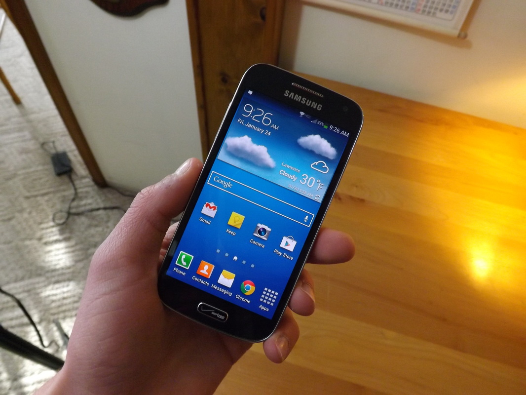
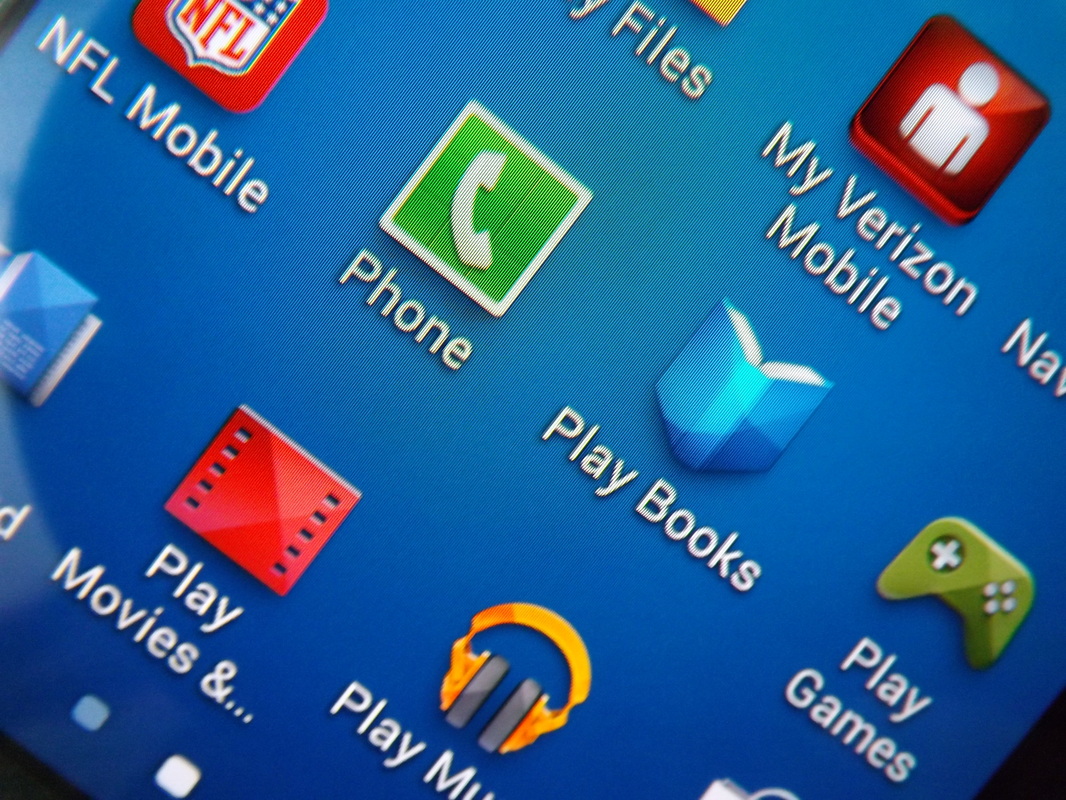
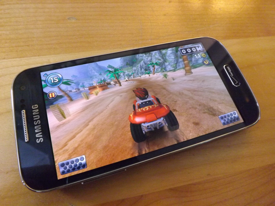
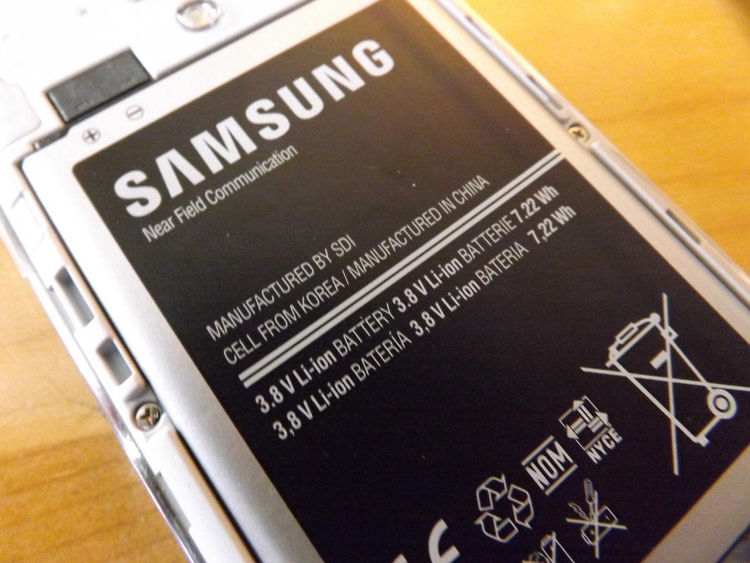
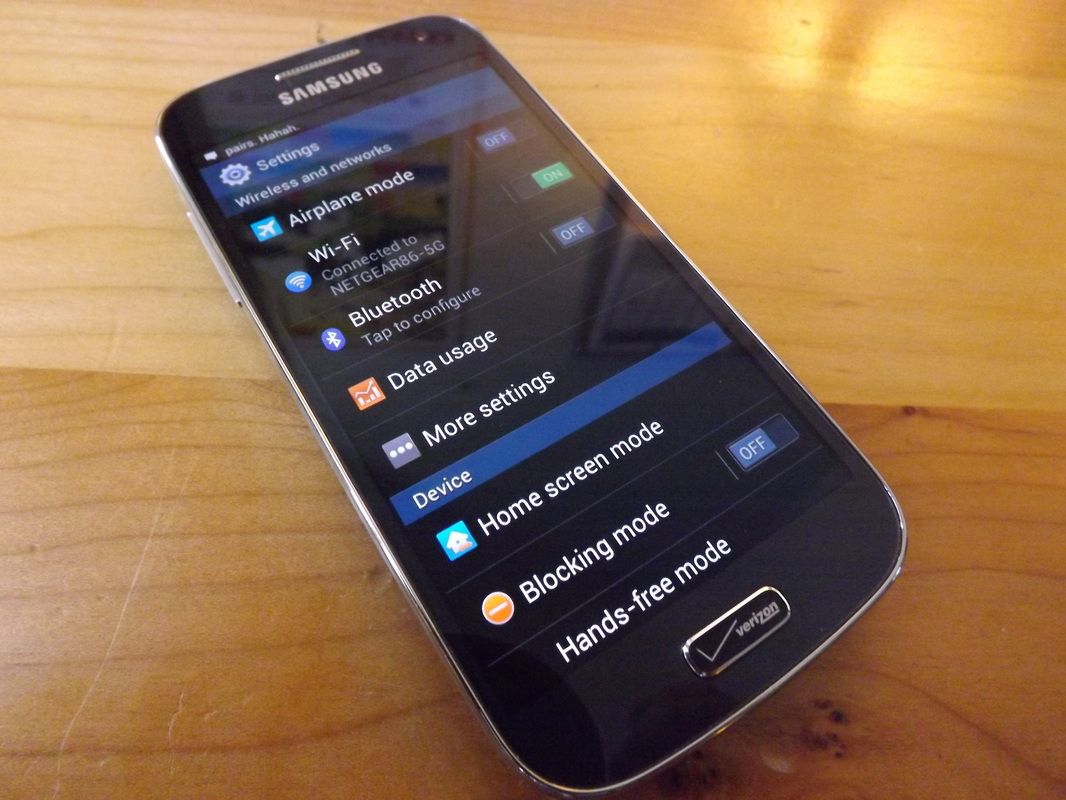
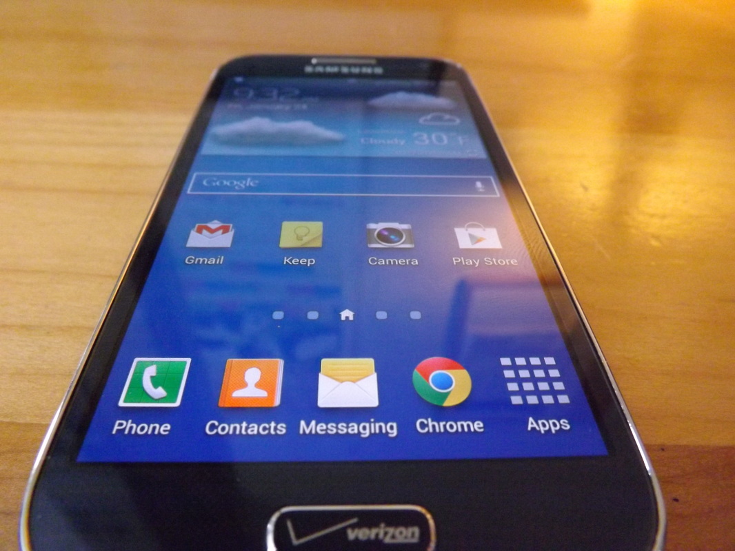
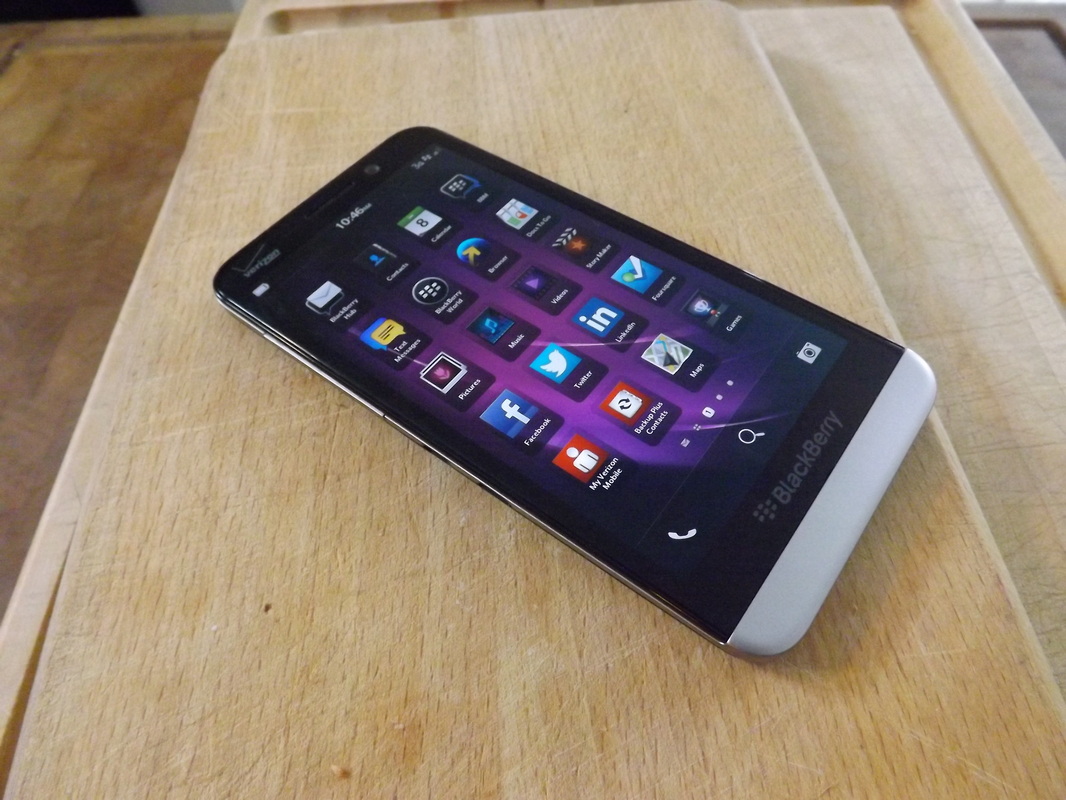
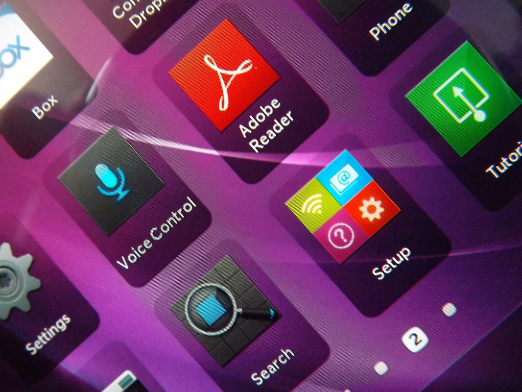
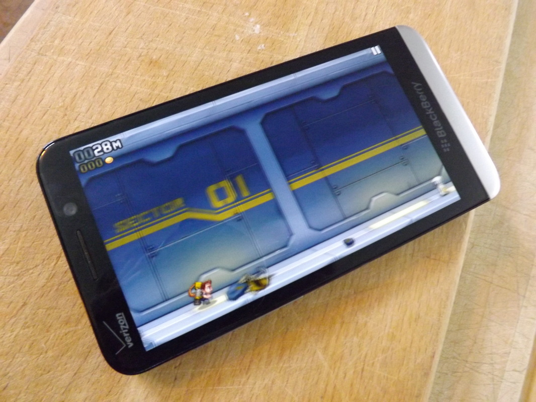
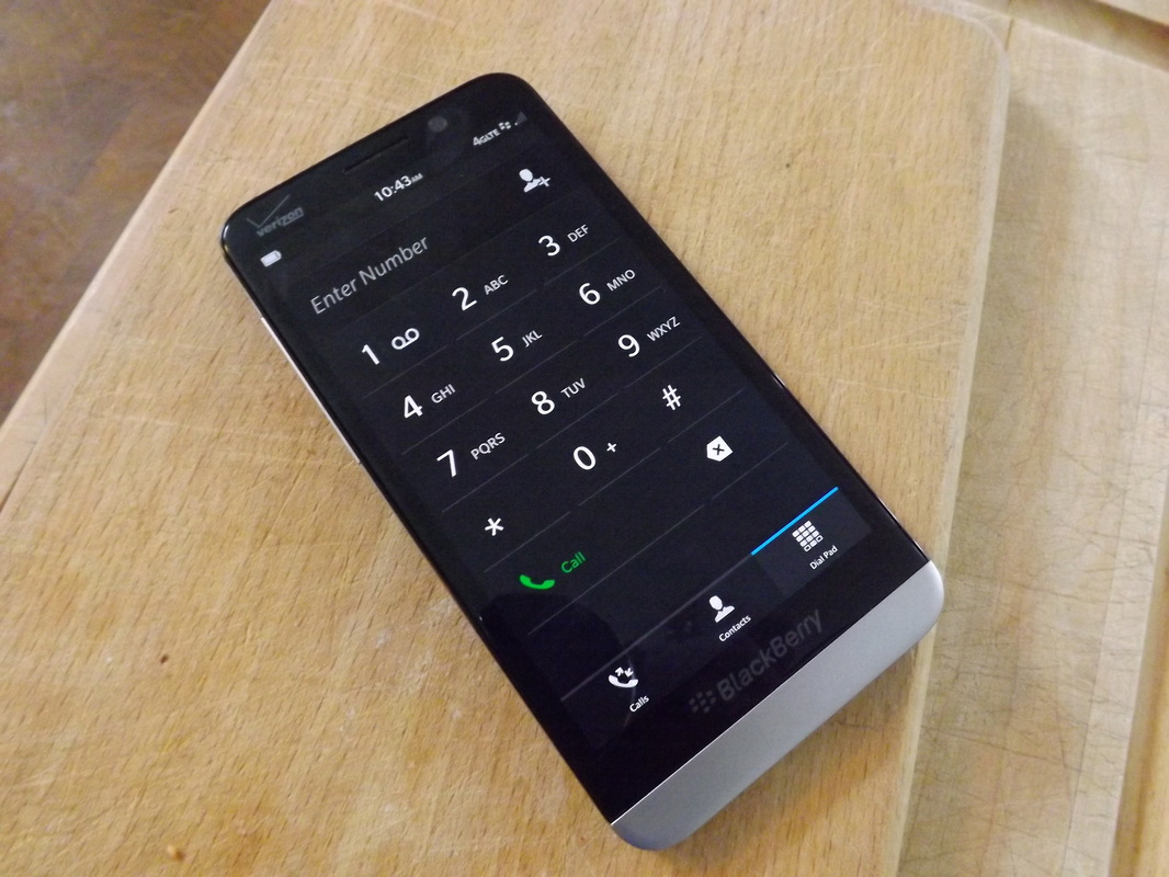
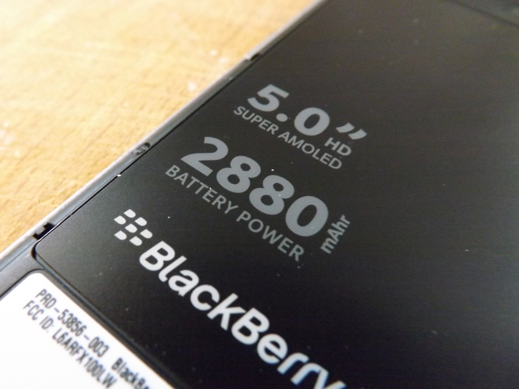
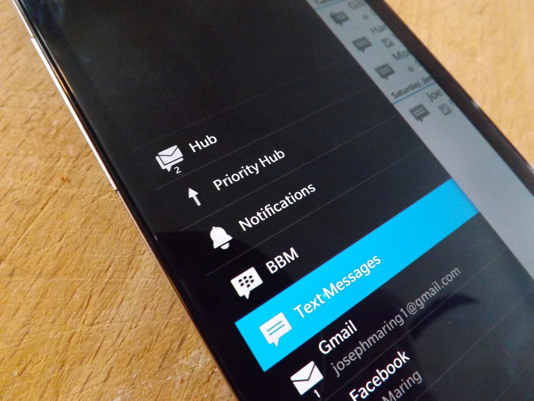
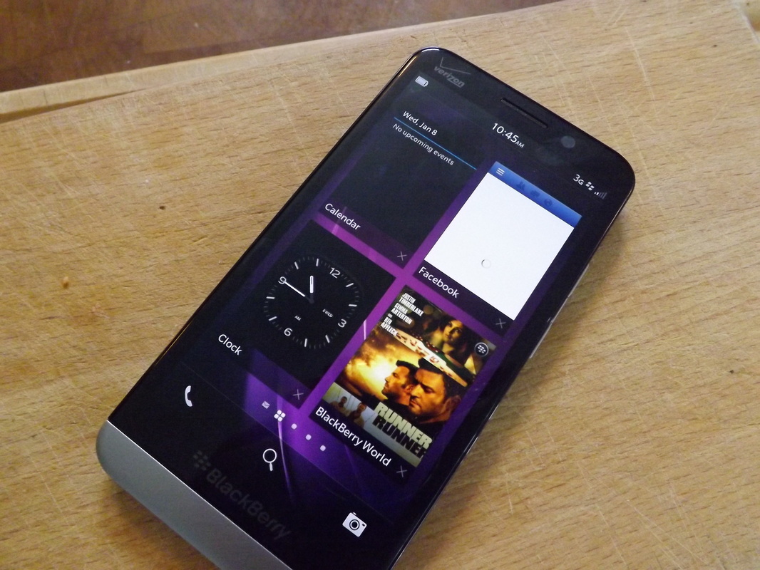
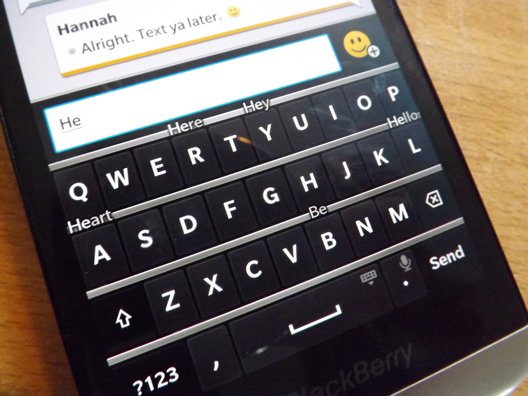
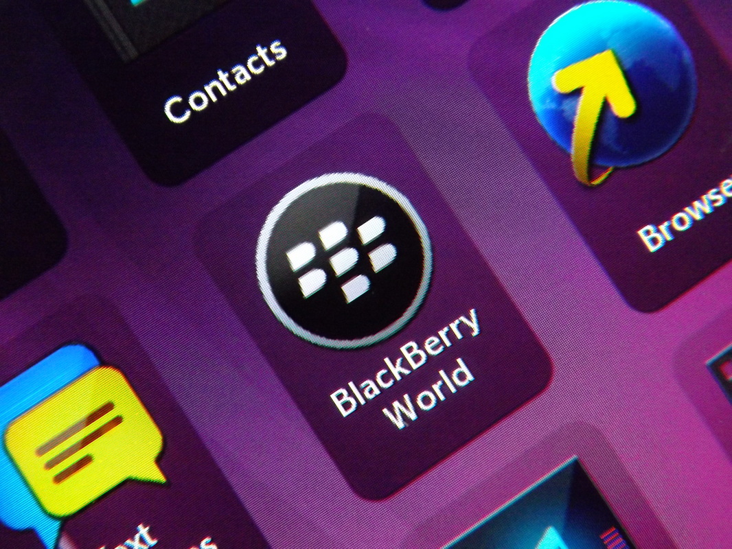
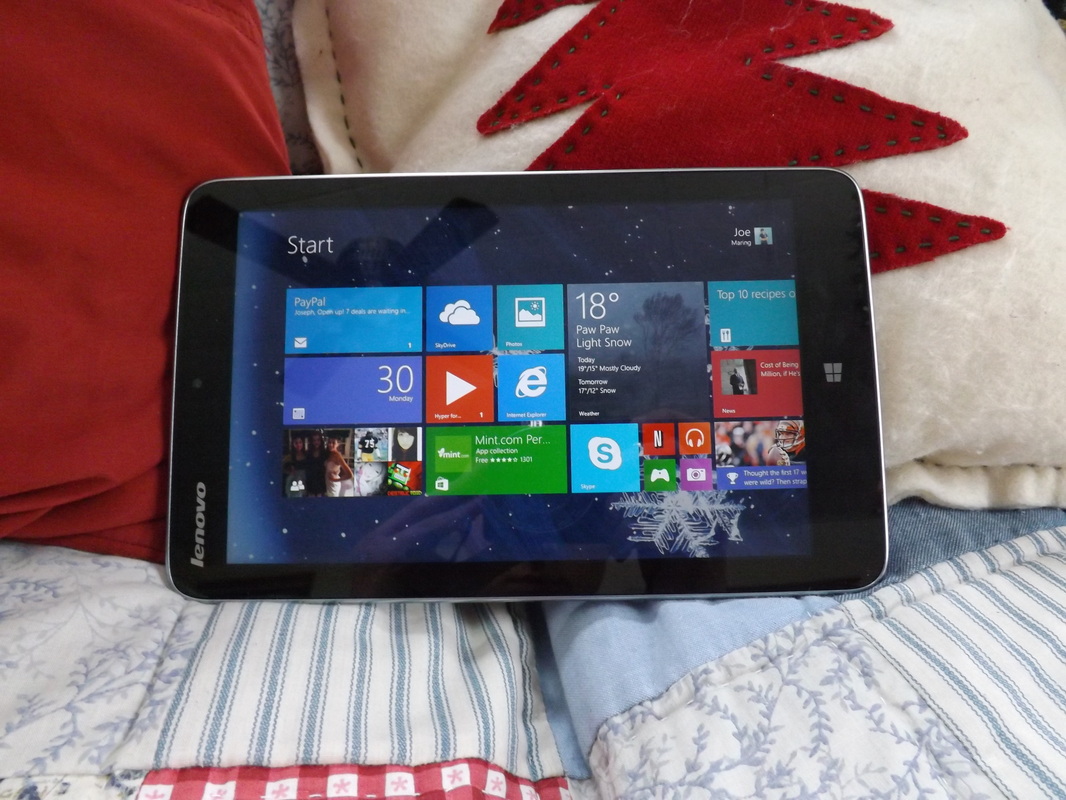
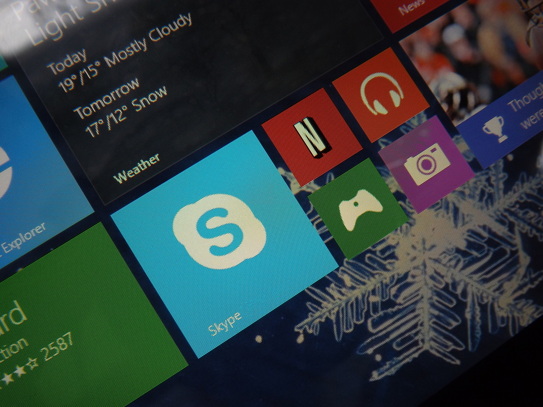
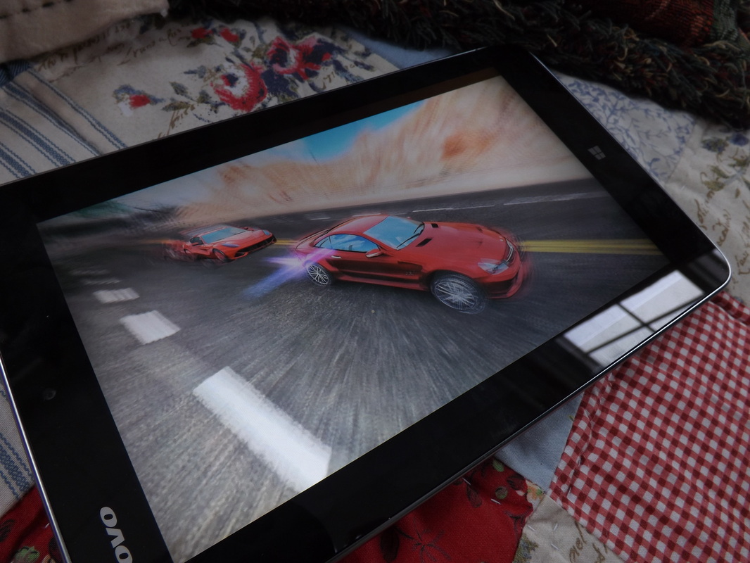
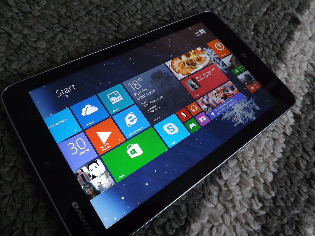
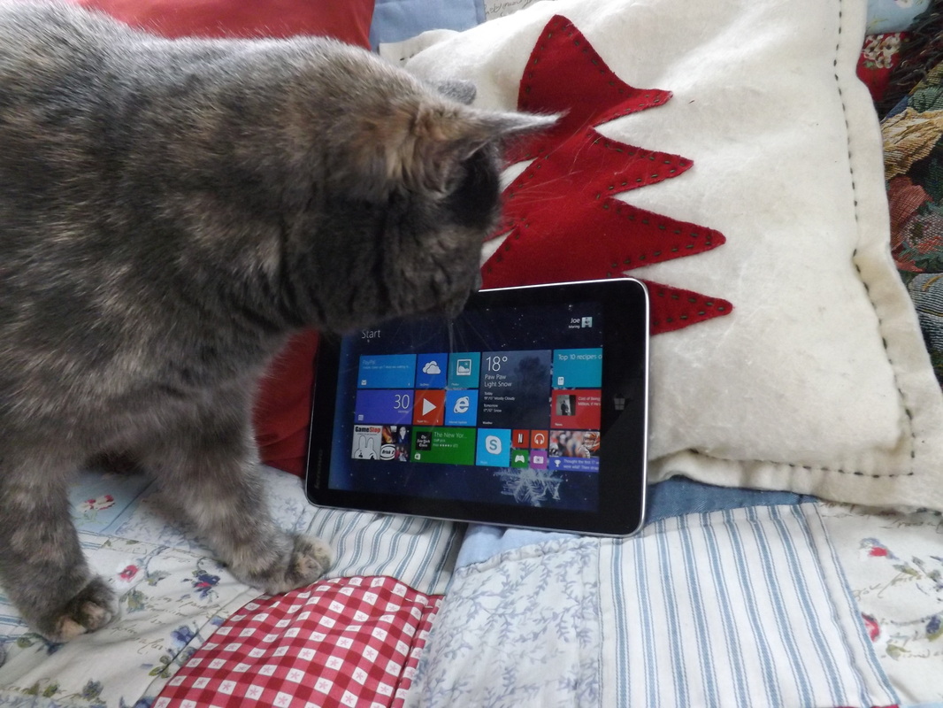
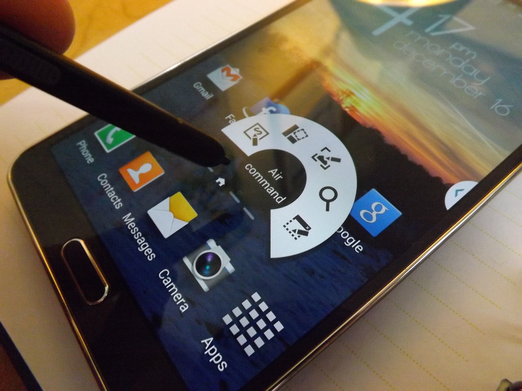
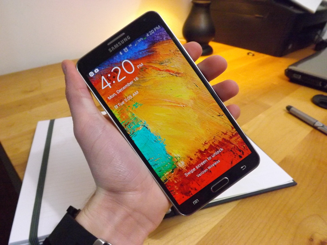
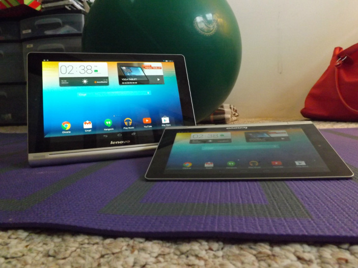
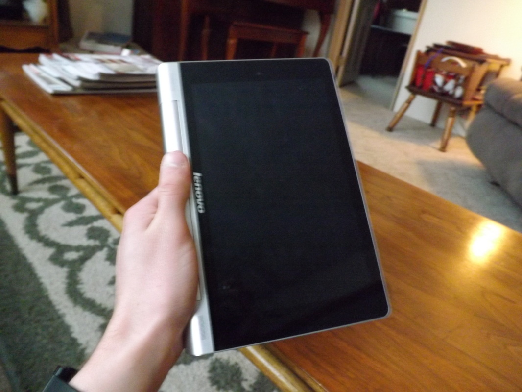
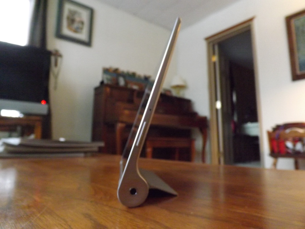
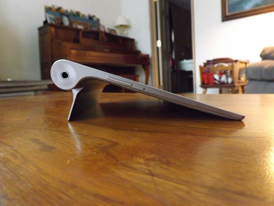
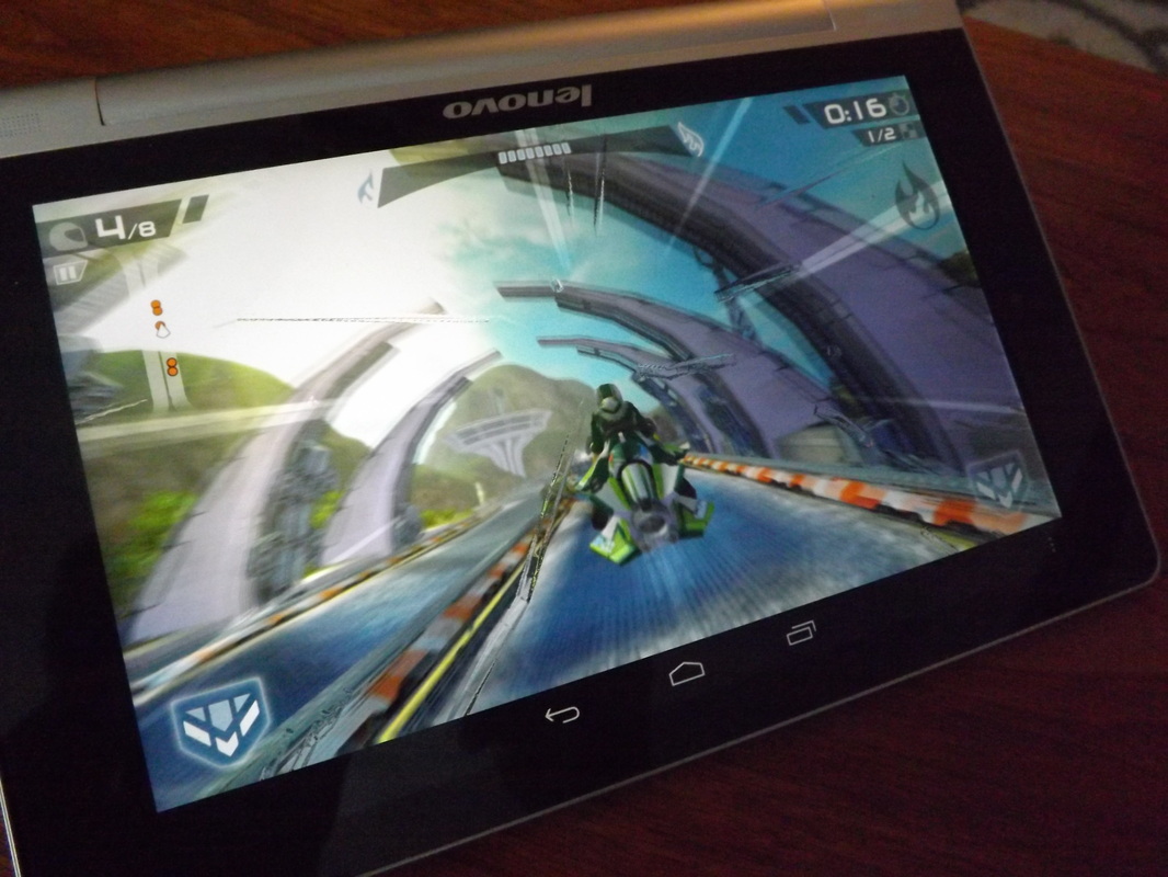
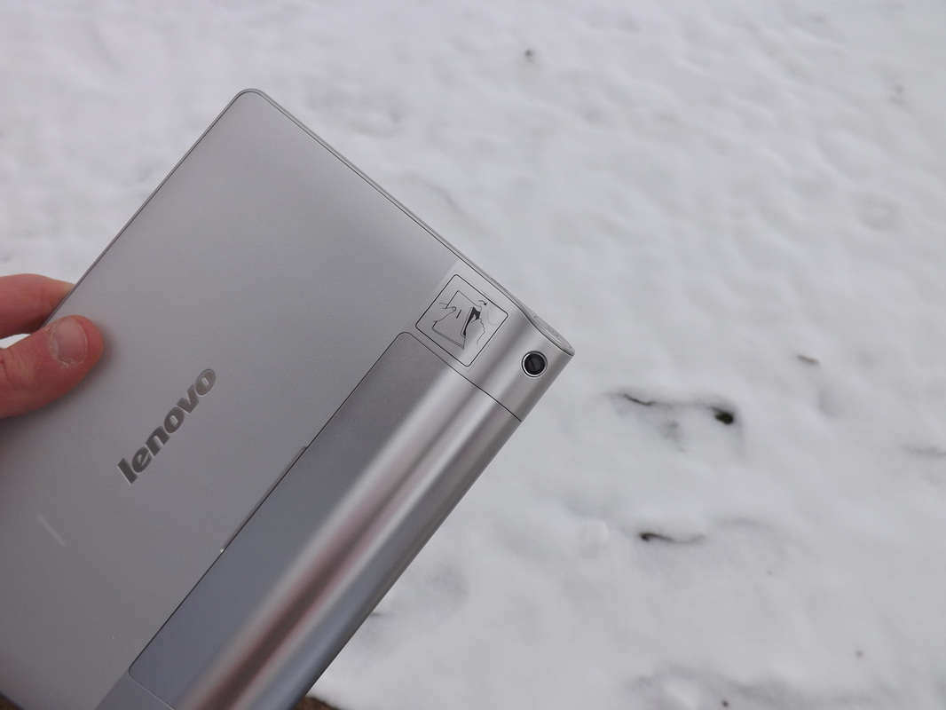
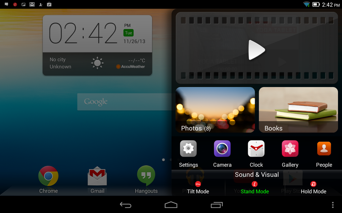
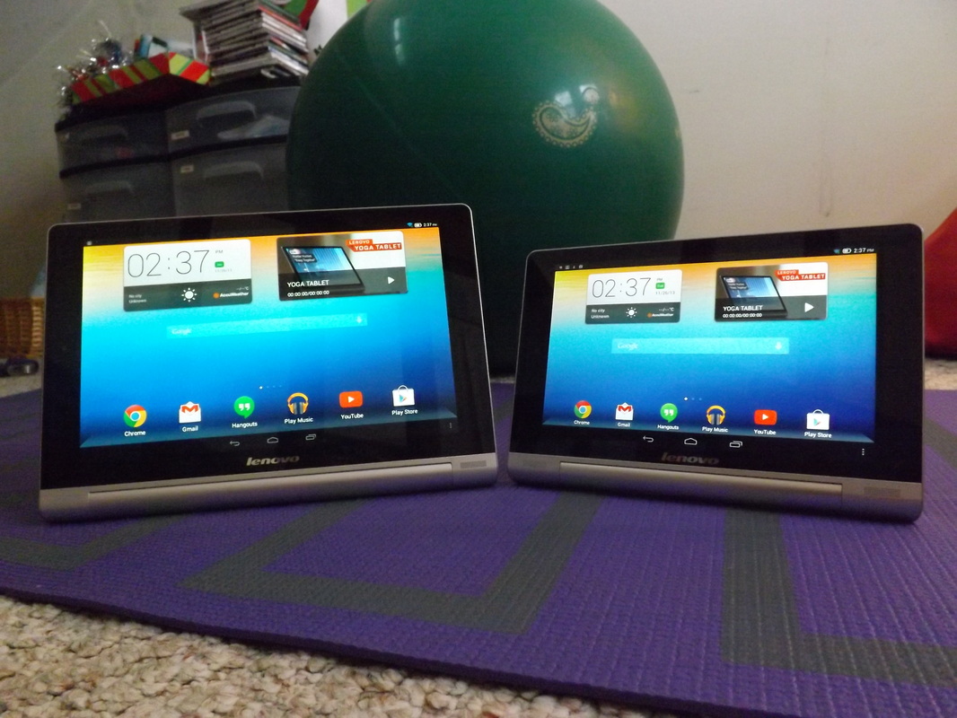
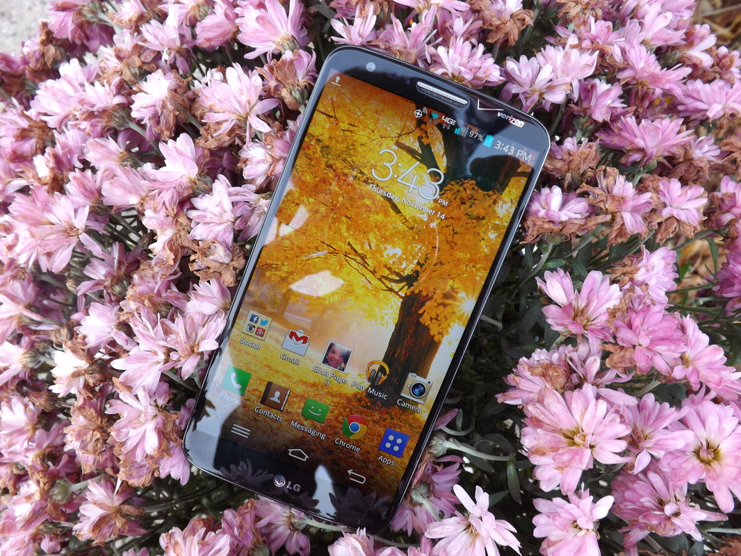
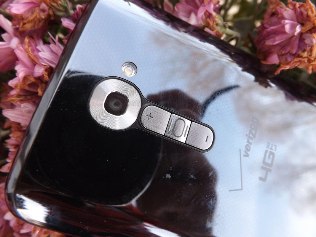
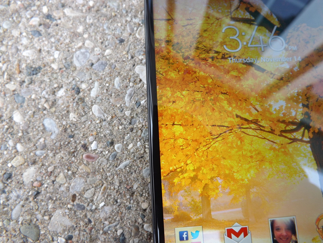
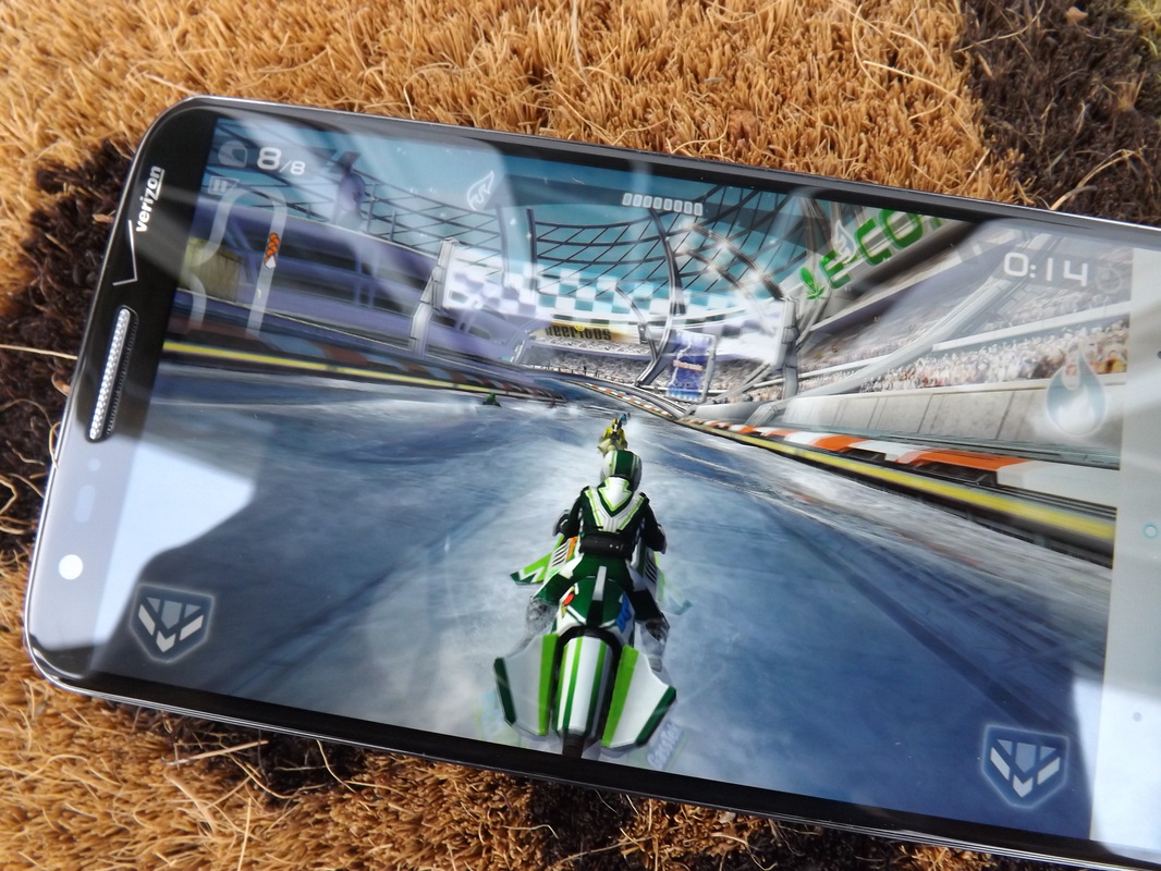
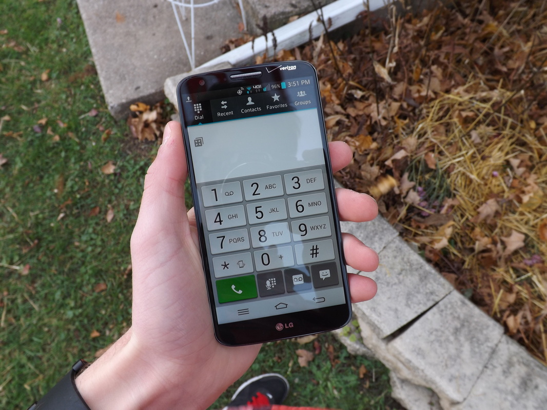
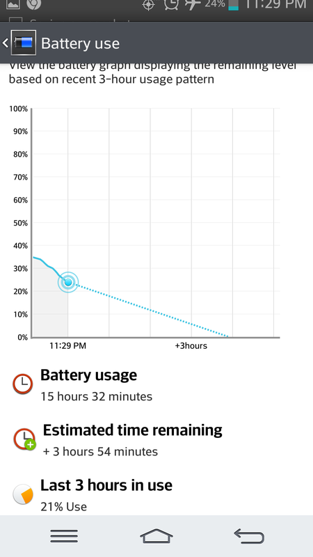
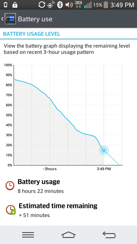
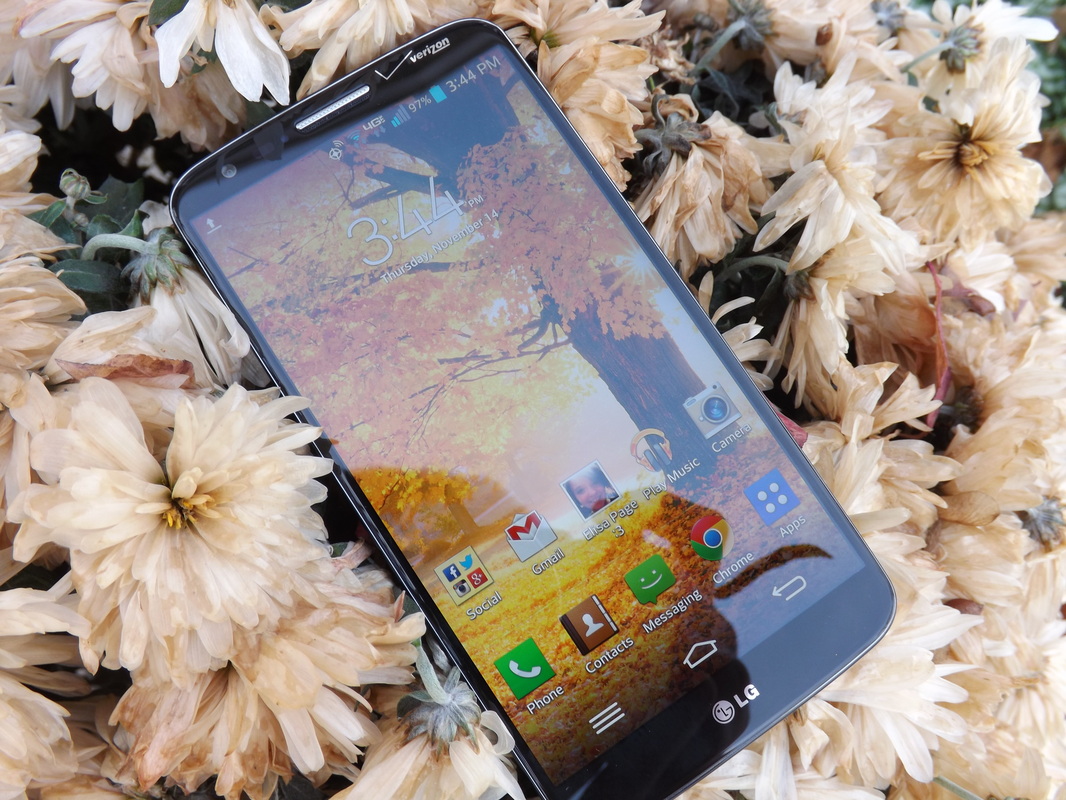
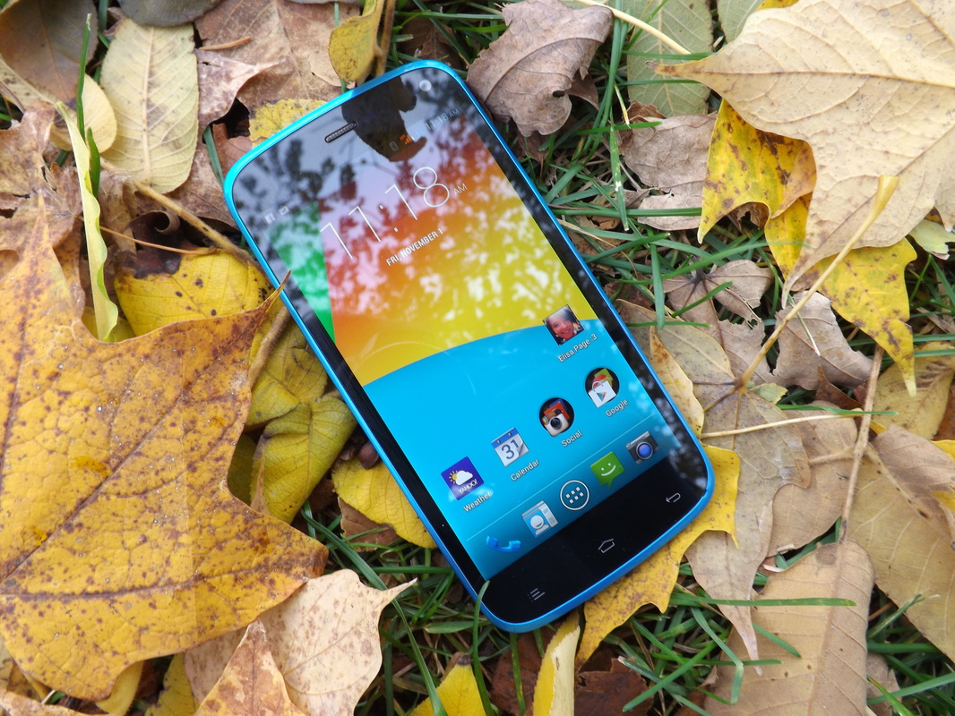
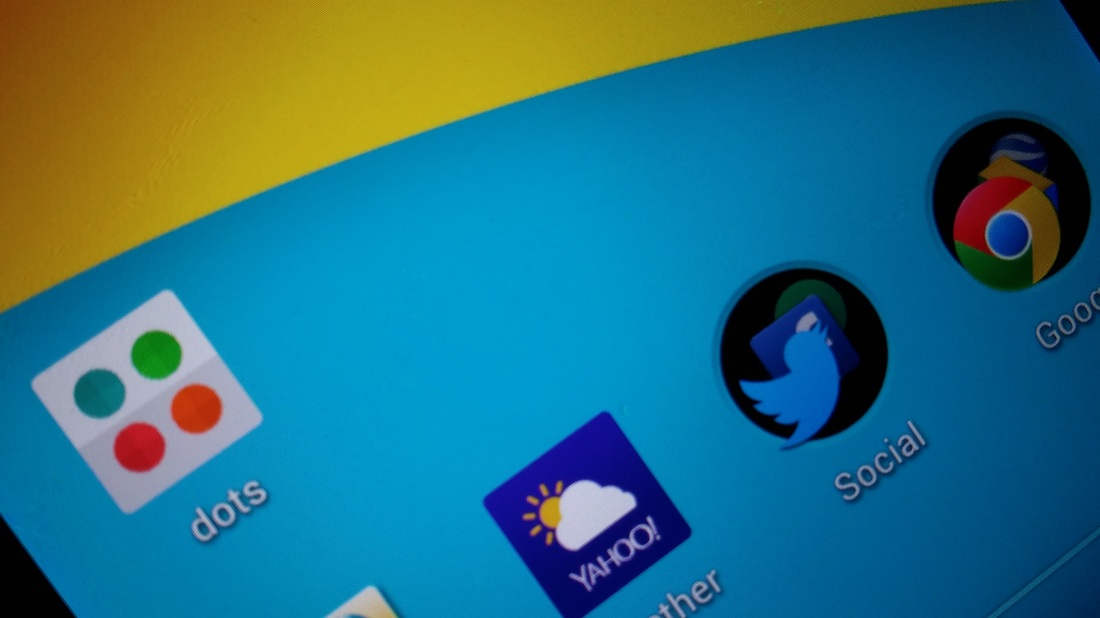
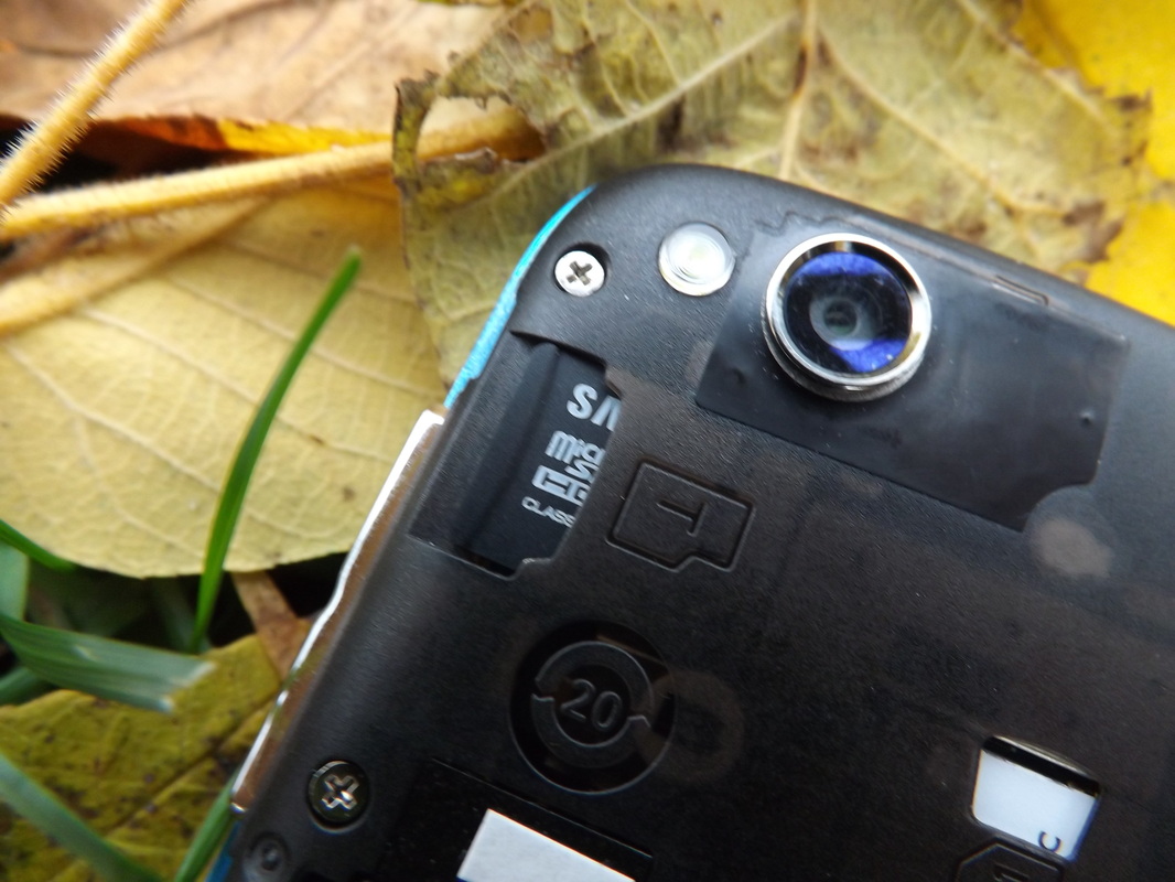
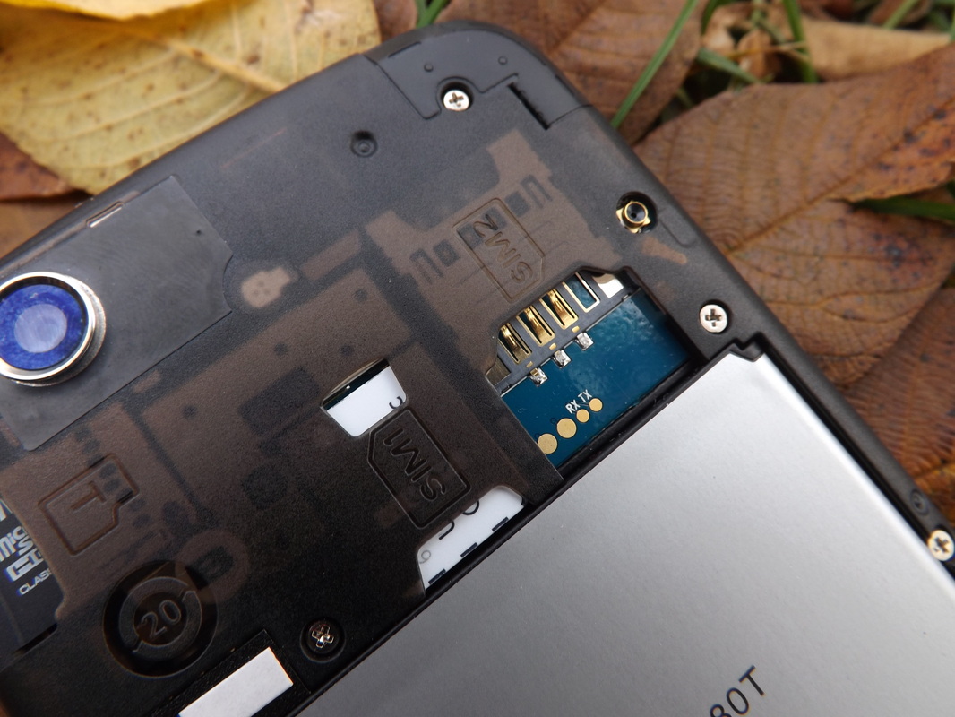
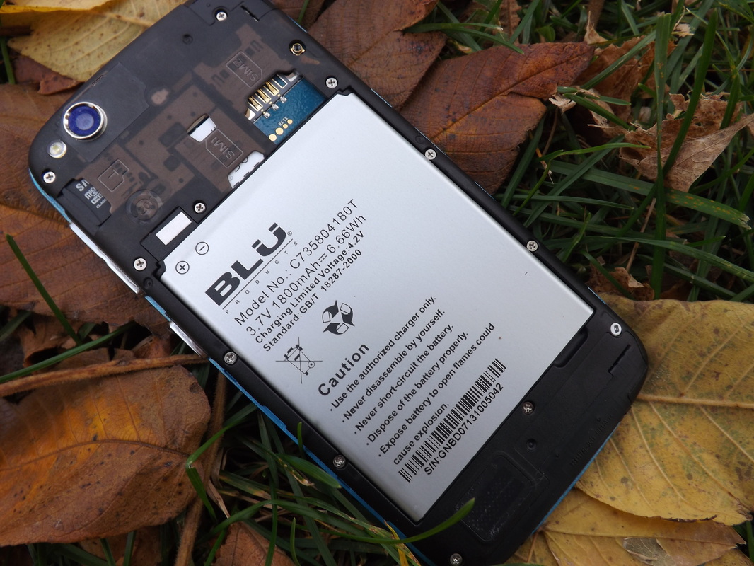
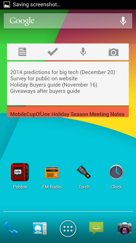
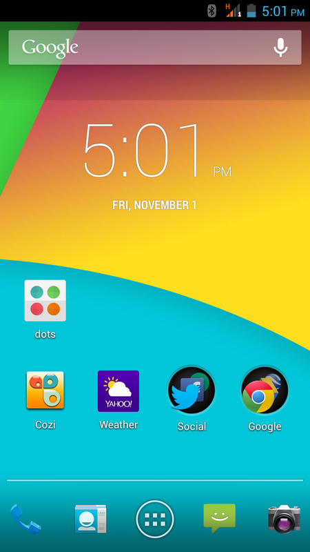
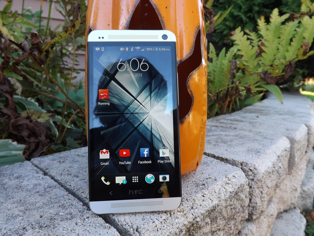
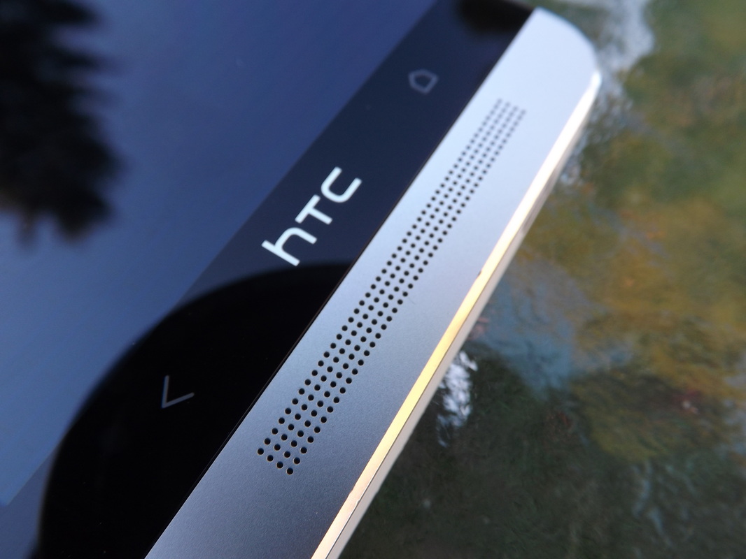
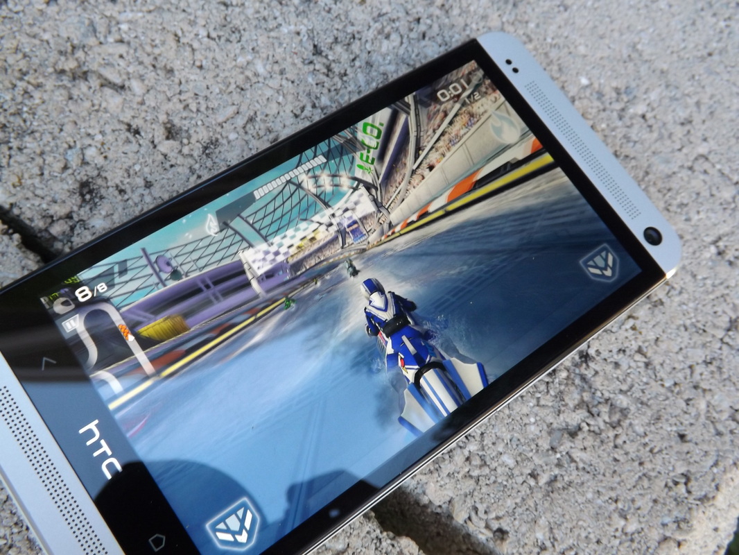
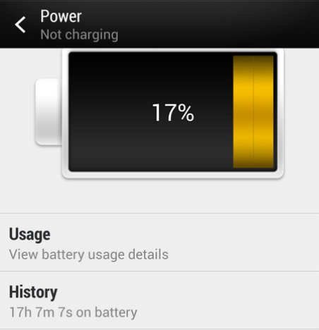
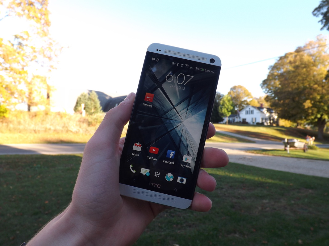
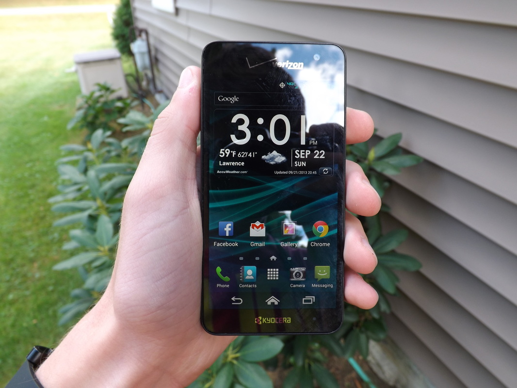
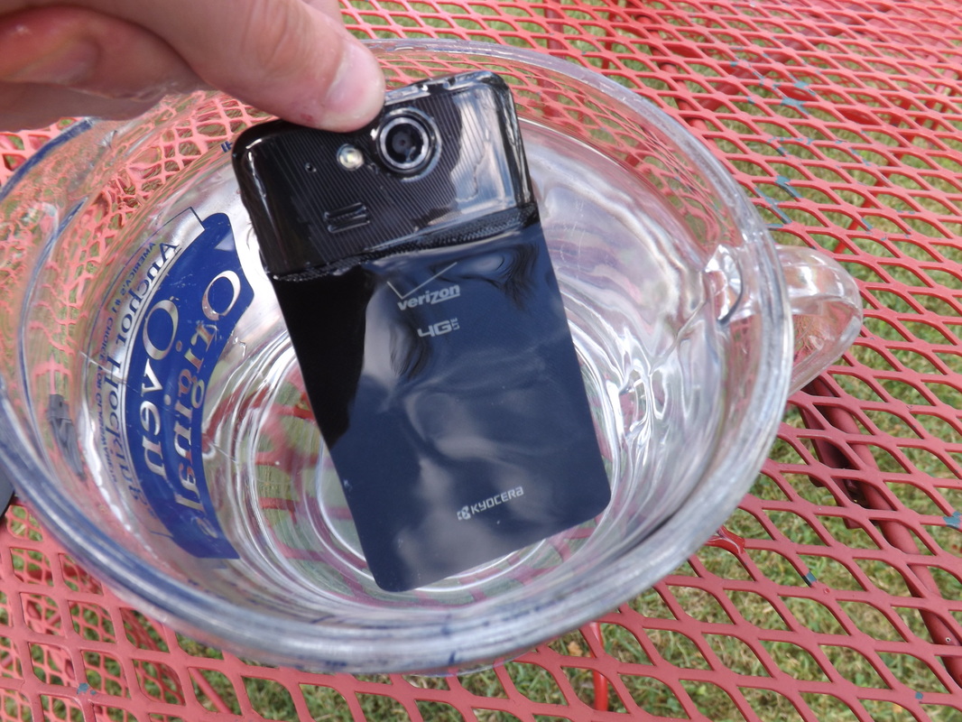
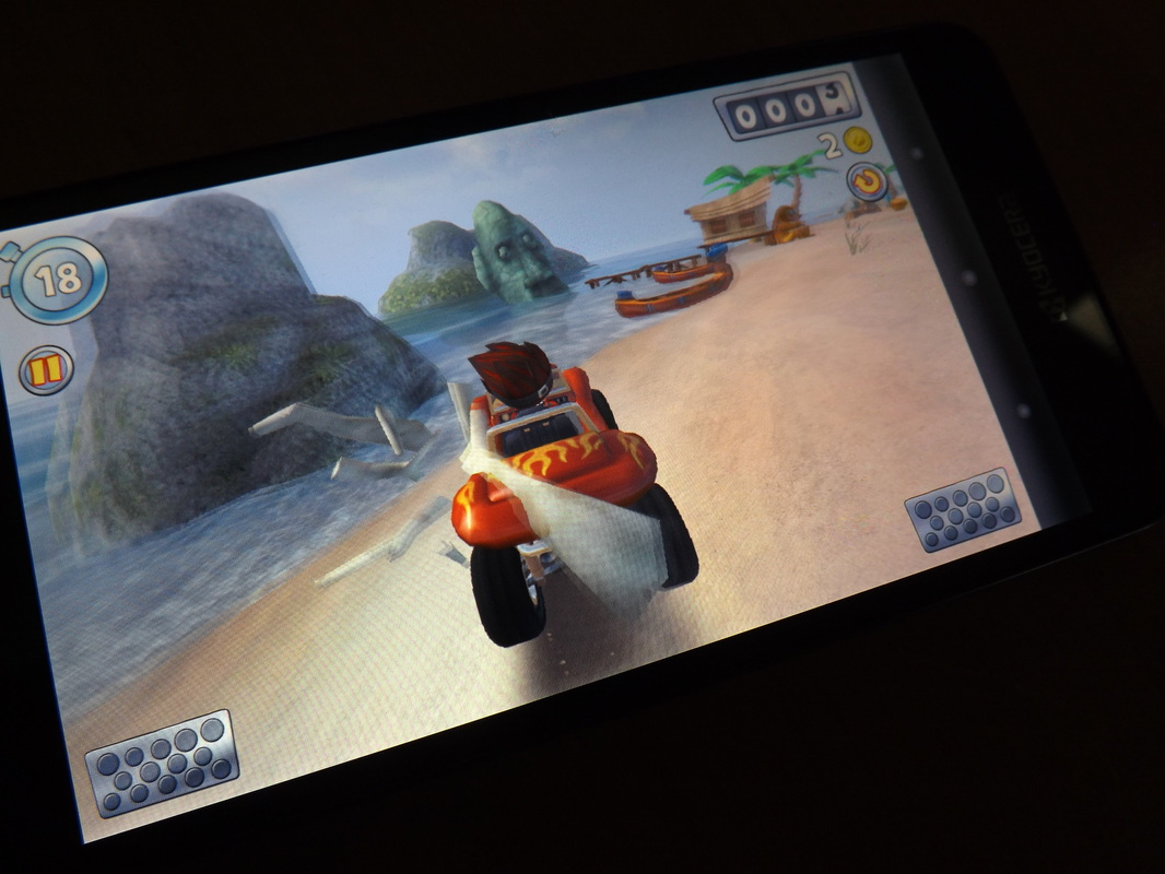
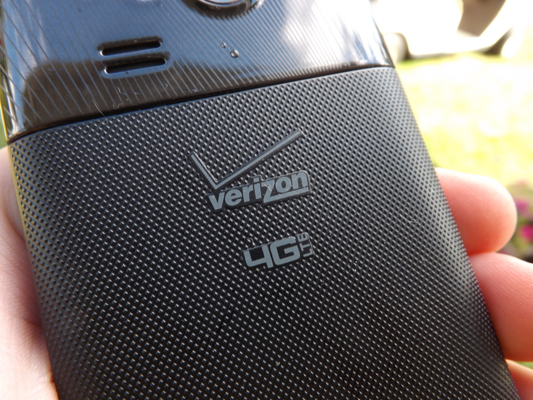
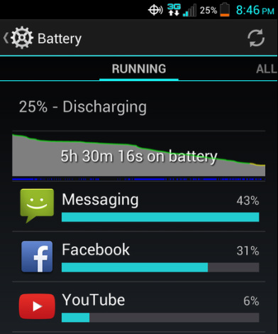
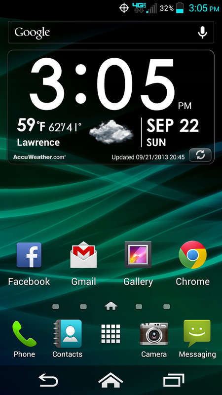
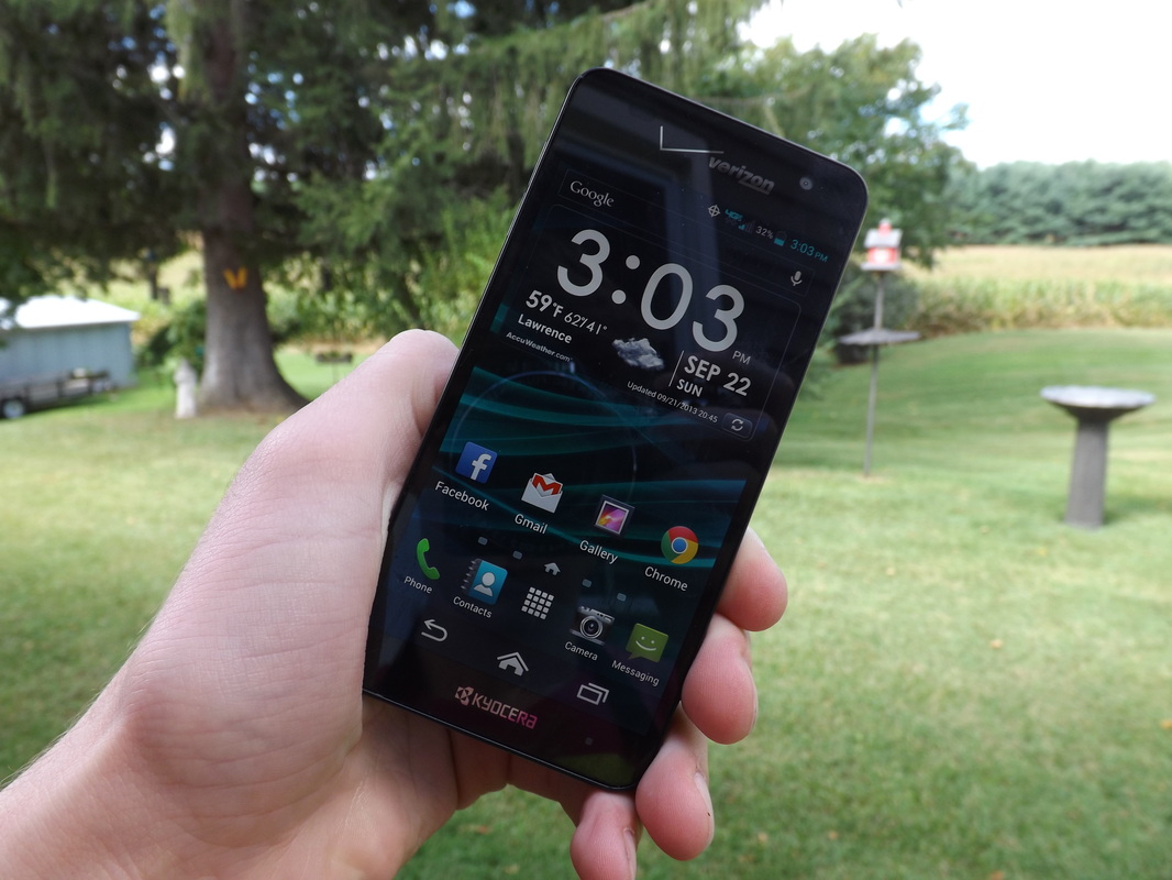
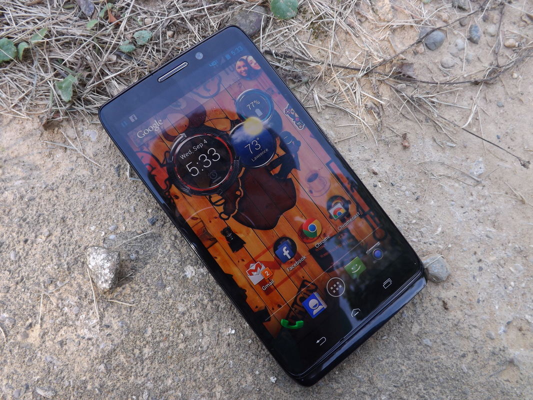
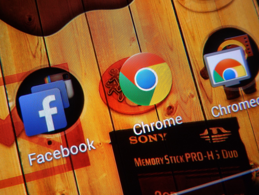
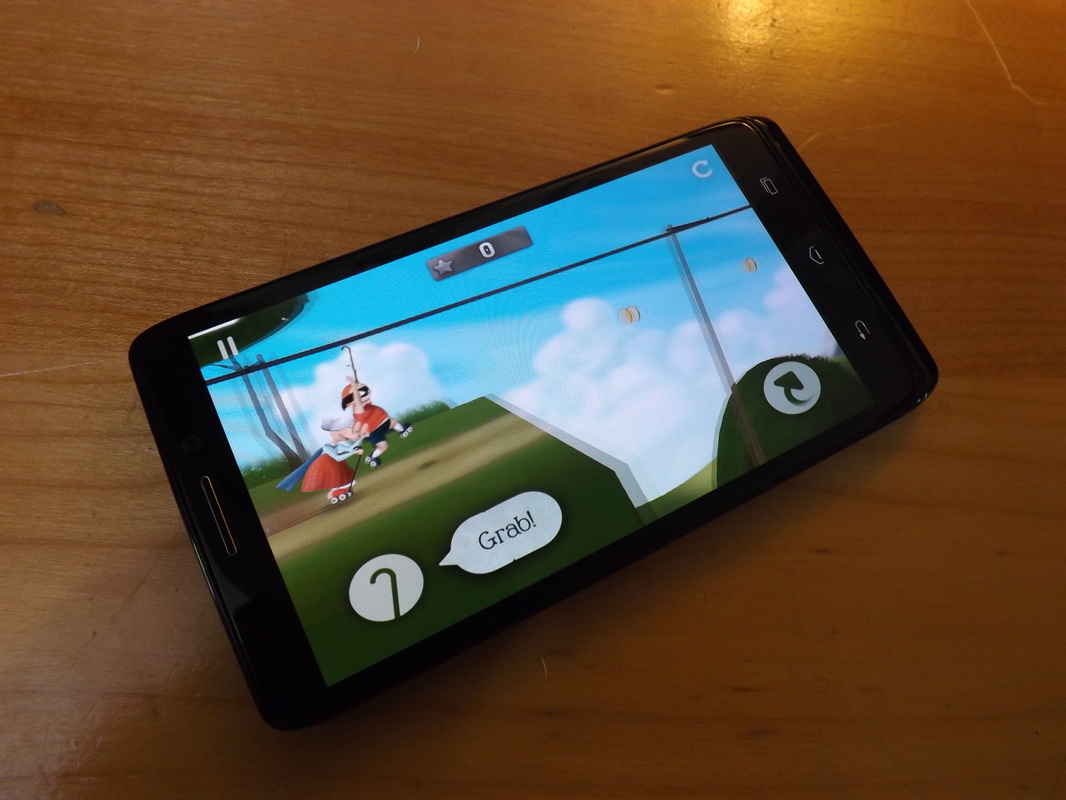
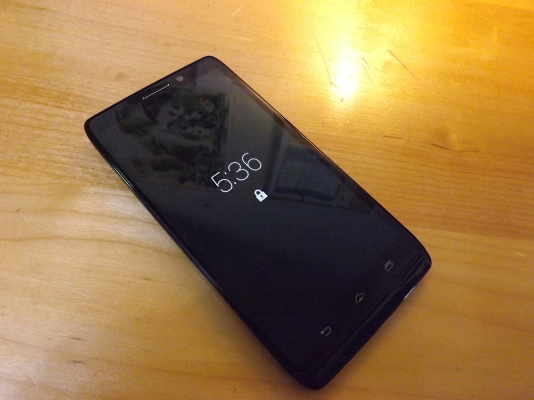
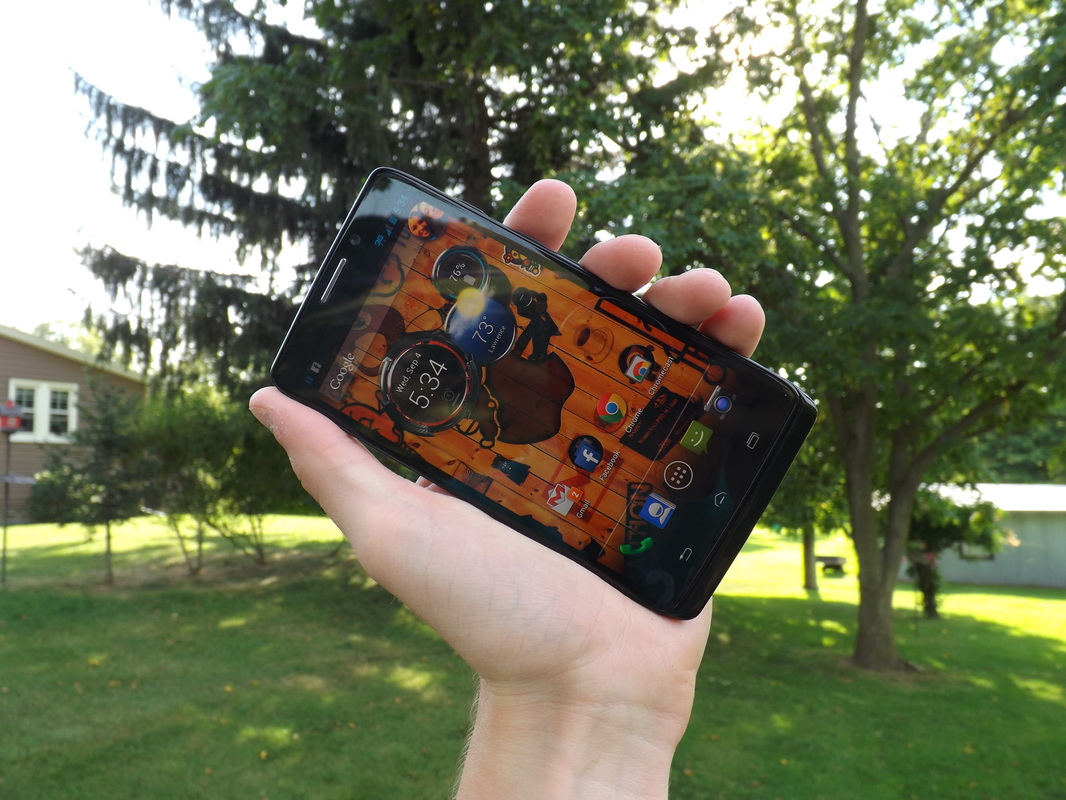
 RSS Feed